How to visualise data with quirky hand-drawn plots
Want to dumb-down your plots and charts for your target audience? CuteCharts allows you to create quirky plots with a hand-drawn feel. Here's how it works.

Charts and plots can often look a bit stale and professional, which might not be appropriate in every setting. If you want to dumb-down your charts and make them look a bit friendlier and less intimidating for your target audience, you might want to consider CuteCharts.
This quirky Python package works with Pandas and allows you to produce charts and plots with a unique hand-drawn look, and includes bar plots, line plots, pie charts, radar charts, and scatter plots. Here’s how it works.
Load the packages
To get started, open a Jupyter notebook and load up the packages below. We’ll be using Pandas to create some data to visualise, and CuteCharts to create the plots and graphs. You can install CuteCharts by typing pip3 install cutecharts into your terminal.
import pandas as pd
from cutecharts.charts import Bar
from cutecharts.charts import Pie
from cutecharts.charts import Line
from cutecharts.charts import Radar
from cutecharts.charts import Scatter
from cutecharts.components import Page
Create some dataframes
Next, we’ll create a couple of dataframes containing some simple data to plot…
data = {'Lord': ['Lord of the Rings','Lord of the Flies','Lord of the Dance'],
        'Votes': [2121, 7885, 10195]}
df_lords = pd.DataFrame(data, columns = ['Lord', 'Votes'])
df_lords.head()
| Lord | Votes | |
|---|---|---|
| 0 | Lord of the Rings | 2121 |
| 1 | Lord of the Flies | 7885 |
| 2 | Lord of the Dance | 10195 |
data = {'Day': ['Mon', 'Tue', 'Wed', 'Thu', 'Fri', 'Sat', 'Sun'],
        'This week': [12, 10, 9, 9, 10, 3, 3],
        'Last week': [15, 12, 8, 9, 11, 4, 3]
       }
df_coffee = pd.DataFrame(data, columns = ['Day', 'This week', 'Last week'])
df_coffee.head()
| Day | This week | Last week | |
|---|---|---|---|
| 0 | Mon | 12 | 15 |
| 1 | Tue | 10 | 12 |
| 2 | Wed | 9 | 8 |
| 3 | Thu | 9 | 9 |
| 4 | Fri | 10 | 11 |
Create a bar chart
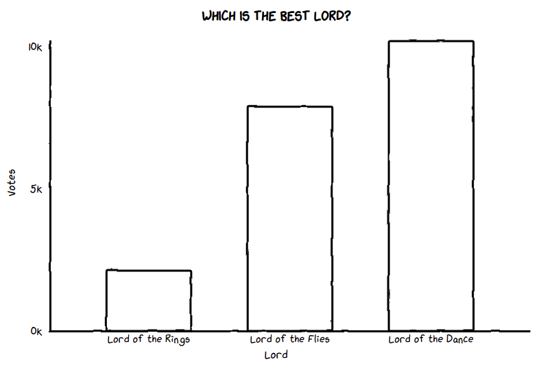
Creating plots in CuteCharts is slightly more long-winded than doing it in Seaborn, but still quicker than bog-standard Matplotlib. First, we’ll instantiate a new chart set the to Bar() type and we’ll assign a title that we’ll set to display in uppercase letters.
Then we’ll define the chart options using the set_options() function. This requires the column of labels from our df_lords dataframe, a name for the x_label, and a name for the y_label.
Finally, we add a series of data containing the votes, and use the render_notebook() function to display the chart. CuteCharts are JavaScript based, so you can hover over them to see tooltips containing the raw metrics.
chart = Bar(str.upper('Which is the best Lord?'))
chart.set_options(
    labels=list(df_lords['Lord']),
    x_label='Lord',
    y_label='Votes'
)
chart.add_series('Lord of the Dance', list(df_lords['Votes']))
chart.render_notebook()
Create a pie chart
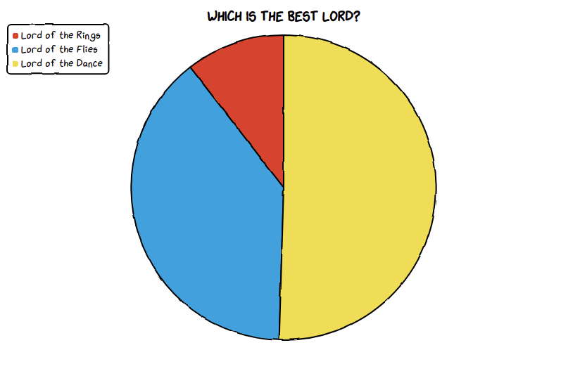
We can use the same dataframe of Lords to create a pie chart. This only requires the labels containing each Lord’s name, plus an inner_radius value, which can be set to a value over zero to turn the pie into a donut.
chart = Pie(str.upper('Which is the best Lord?'))
chart.set_options(
    labels=list(df_lords['Lord']),
    inner_radius=0
)
chart.add_series(list(df_lords['Votes']))
chart.render_notebook()
Create a line chart
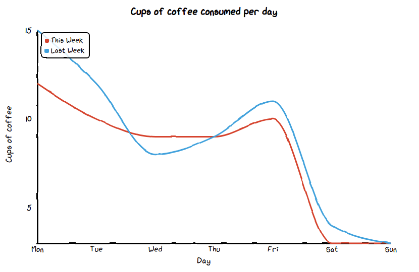
For the line chart we’ll use the coffee consumption dataframe. The concept is similar to the bar chart, except that we add multiple series’ of data containing each dataframe series or column that we want to plot.
chart = Line('Cups of coffee consumed per day')
chart.set_options(
    labels=list(df_coffee['Day']),
    x_label='Day',
    y_label='Cups of coffee'
    )
chart.add_series('This Week', list(df_coffee['This week']))
chart.add_series('Last Week', list(df_coffee['Last week']))
chart.render_notebook()
Create a radar chart
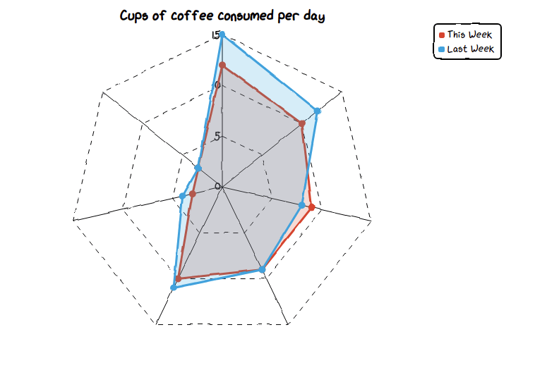
The radar plot can also be produced using the coffee consumption dataset. With this one, we’re manually defining the legend position as the upper right of the page.
chart = Radar('Cups of coffee consumed per day')
chart.set_options(
    labels=list(df_coffee['Day']),
    is_show_legend=True,
    legend_pos='upRight'
    )
chart.add_series('This Week', list(df_coffee['This week']))
chart.add_series('Last Week', list(df_coffee['Last week']))
chart.render_notebook()
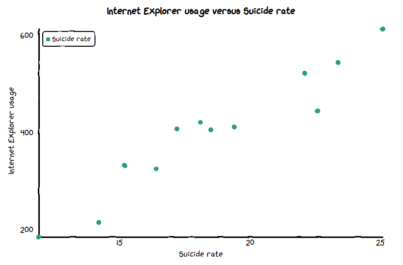
Create a scatter plot
Finally, we can create a simple scatter graph or scatter plot using Scatter(). Here, we need to provide set_options() with the x_label, y_label, and an optional custom colour for the dots. The add_series() function then takes a zip() of the two metrics, so we can plot any relationship between the two.
suicide_rate = [14.2, 16.4, 11.9, 15.2, 18.5, 22.1, 19.4, 25.1, 23.4, 18.1, 22.6, 17.2]
ie_usage     = [215, 325, 185, 332, 406, 522, 412, 614, 544, 421, 445, 408]

chart = Scatter('Internet Explorer usage versus Suicide rate')
chart.set_options(
    x_label='Suicide rate',
    y_label='Internet Explorer usage',
    colors=['#009989'],
    )
chart.add_series('Suicide rate', [(z[0], z[1]) for z in zip(suicide_rate, ie_usage)])
chart.render_notebook()
Matt Clarke, Monday, March 08, 2021


Other posts you might like

How to use the Pandas truncate() function
Have you ever needed to chop the top or bottom off a Pandas dataframe, or extract a specific section from the middle? If so, there’s a Pandas function called truncate()...

How to use Spacy for noun phrase extraction
Noun phrase extraction is a Natural Language Processing technique that can be used to identify and extract noun phrases from text. Noun phrases are phrases that function grammatically as nouns...