How to resample time series data in Pandas
The Pandas resample function lets you group time series data by day, week, month, or year so it can be visualised or used to create model features.

When working with time series data, such as web analytics data or ecommerce sales, the time series format in your dataset might not be ideal for the analysis you’re performing or the model you’re building. For example, a datetime stamp which includes the full time and date, is very granular but grouping data together by day, week, month, or year can often make the data much easier to understand and visualise.
Coming from the world of MySQL, it’s very easy to resample time series data. You simply wrap the date column in a YEAR() or MONTH() function and MySQL will convert it for you, allowing you to group the data accordingly. However, it’s not obvious how to do this in Pandas, but it is actually very easy when you know how.
As you’d imagine for what has become the number one data wrangling tool, Pandas has a built-in function that allows you to resample time series data - it’s called resample() and it’s really powerful. Here’s how you can use it.
Load the data
For this project you’ll need Pandas and a visualisation library. I’ve used Seaborn, which is a wrapper to the popular Matplotlib library. It produces really nice looking plots with minimal code. To further cut down on code, you can also define settings to apply to all uses of its functions. The ones below set the figure size and turn on “retina” mode on the figures so they look nicer on higher resolution displays.
import pandas as pd
import seaborn as sns
sns.set(rc={'figure.figsize':(15, 6)})
sns.set_context('notebook')
%config InlineBackend.figure_format = 'retina'
Load the data
You can, of course, use any data you like. I’ve created a time series data set on some web traffic from one of my personal websites. You can load this directly from my GitHub and set the ga:date field to be parsed as a date when it’s loaded into Pandas.
df = pd.read_csv('https://raw.githubusercontent.com/flyandlure/datasets/master/sessions.csv',
                 parse_dates=['ga:date'])
df.head()
| ga:date | ga:pageviews | |
|---|---|---|
| 0 | 2016-01-01 | 7566 |
| 1 | 2016-01-02 | 98 |
| 2 | 2016-01-03 | 1127 |
| 3 | 2016-01-04 | 98 |
| 4 | 2016-01-05 | 3675 |
df.info()
<class 'pandas.core.frame.DataFrame'>
RangeIndex: 1766 entries, 0 to 1765
Data columns (total 2 columns):
 #   Column        Non-Null Count  Dtype
---  ------        --------------  -----
 0   ga:date       1766 non-null   datetime64[ns]
 1   ga:pageviews  1766 non-null   int64
dtypes: datetime64[ns](1), int64(1)
memory usage: 27.7 KB
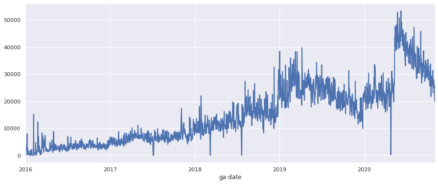
Resample to daily
The data in this dataset are in date format, but if they were datetime format we could resample the data to daily using the resample() function with the D argument. To do this, we’ll ensure the ga:date column is set as an index, then resample the data to daily, then calculate the sum() of the ga:pageviews column and return a dataframe.
df_daily = df.set_index('ga:date').resample('D')["ga:pageviews"].sum().to_frame()
df_daily.tail()
| ga:pageviews | |
|---|---|
| ga:date | |
| 2020-10-27 | 26916 |
| 2020-10-28 | 24995 |
| 2020-10-29 | 25764 |
| 2020-10-30 | 20119 |
| 2020-10-31 | 19786 |
To plot the data via Seaborn, all you need to do is define the column you want to plot and prepend it to the plot() function. The optional linewidth argument makes the line a bit clearer to read.
chart = df_daily['ga:pageviews'].plot(linewidth=2)
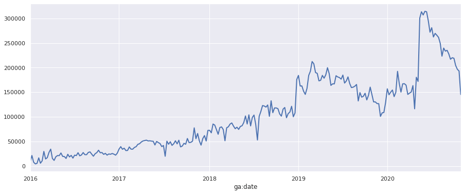
Resample to weekly
The exact same approach can be used to downsample the data from daily to weekly, simply by changing the argument passed to resample() from D to W. We now get a dataframe of total pageviews by week, which we can plot in the same manner as above. The lower resolution on the data makes it much easier to read.
df_weekly = df.set_index('ga:date').resample('W')["ga:pageviews"].sum().to_frame()
df_weekly.tail()
| ga:pageviews | |
|---|---|
| ga:date | |
| 2020-10-04 | 219118 |
| 2020-10-11 | 204518 |
| 2020-10-18 | 196687 |
| 2020-10-25 | 193188 |
| 2020-11-01 | 145505 |
chart = df_weekly['ga:pageviews'].plot(linewidth=2)
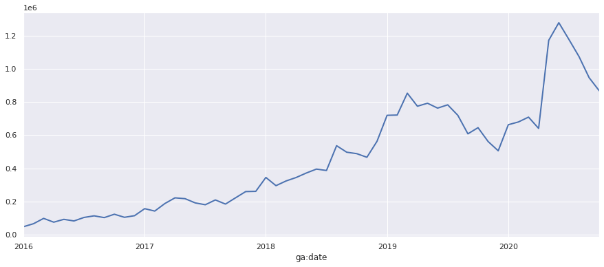
Resample to monthly
To resample our daily date columns down to monthly, we simply pass in the M argument and repeat the process.
df_monthly = df.set_index('ga:date').resample('M')["ga:pageviews"].sum().to_frame()
df_monthly.tail()
| ga:pageviews | |
|---|---|
| ga:date | |
| 2020-06-30 | 1277732 |
| 2020-07-31 | 1176711 |
| 2020-08-31 | 1073364 |
| 2020-09-30 | 946198 |
| 2020-10-31 | 867440 |
chart = df_monthly['ga:pageviews'].plot(linewidth=2)
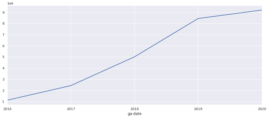
Resample to annually
Finally, for a really broad view, we can resample the data to annually or yearly by passing in the Y argument.
df_yearly = df.set_index('ga:date').resample('Y')["ga:pageviews"].sum().to_frame()
df_yearly.tail()
| ga:pageviews | |
|---|---|
| ga:date | |
| 2016-12-31 | 1127968 |
| 2017-12-31 | 2437099 |
| 2018-12-31 | 5015582 |
| 2019-12-31 | 8446020 |
| 2020-12-31 | 9204673 |
chart = df_yearly['ga:pageviews'].plot(linewidth=2)
Matt Clarke, Saturday, March 06, 2021


Other posts you might like

How to use the Pandas truncate() function
Have you ever needed to chop the top or bottom off a Pandas dataframe, or extract a specific section from the middle? If so, there’s a Pandas function called truncate()...

How to use Spacy for noun phrase extraction
Noun phrase extraction is a Natural Language Processing technique that can be used to identify and extract noun phrases from text. Noun phrases are phrases that function grammatically as nouns...