How to use the Pandas melt function to reshape wide format data
Learn how to use the Pandas melt function to reshape wide format data so you can use it in your machine learning models.

When you gain access to a new dataset, chances are, it’s probably not in the format you require for analysis or modeling. The most common problem you’ll encounter is datasets that are in “wide format” instead of “long format”.
To understand the differences and how to deal with these two types of data, let’s load up an impractical dataset that’s in wide format and convert it to long format using the Pandas melt function.
Load up some wide format data
One great, and pertinent example of this is the COVID-19 time series dataset from the Center for Systems Science and Engineering at John Hopkins University. Import Pandas, then use the read_csv() function to load the current CSV dataset on confirmed global COVID-19 cases into a DataFrame.
import pandas as pd
URL =  'https://raw.githubusercontent.com/CSSEGISandData/COVID-19/master/csse_covid_19_data/csse_covid_19_time_series/time_series_covid19_confirmed_global.csv'
df = pd.read_csv(URL)
df.sample(3)
| Province/State | Country/Region | Lat | Long | 1/22/20 | ... | 7/20/20 | 7/21/20 | 7/22/20 | 7/23/20 | 7/24/20 | |
|---|---|---|---|---|---|---|---|---|---|---|---|
| 228 | NaN | Vietnam | 14.058324 | 108.277199 | 0 | ... | 384 | 401 | 408 | 412 | 415 |
| 1 | NaN | Albania | 41.153300 | 20.168300 | 0 | ... | 4171 | 4290 | 4358 | 4466 | 4570 |
| 253 | NaN | Burundi | -3.373100 | 29.918900 | 0 | ... | 322 | 328 | 328 | 345 | 345 |
3 rows × 189 columns
As you can see from the DataFrame above (truncated for readability) we have one row per country, with the count of confirmed cases appended as a new column bearing the date on a daily basis. Although it’s convenient and easy to scan, this is not very convenient for modeling or analysis.
Use Pandas melt to reshape the data
Instead of having each country on one row, with the count of confirmed cases in appended and awkwardly names columns, we want a dataset in long format. By putting each observation into a separate row, the data are much easier to analyse, visualise and model. We’ll be able to see, for each given date, how many cases each country had.
To reshape our data from wide format to long format we can use melt and pass in four parameters. Firstly, we pass in the original Pandas dataframe in wide format, then we define the id_vars for the columns we want to keep (Province/State, Country/Region, Lat and Long), and finally we define the var_name as Date and the value_name as Confirmed.
This reshapes the dataframe to put each observation on one row. The dates are converted from column heading names to column values and the number of cases are added to the Confirmed column.
df_melted = pd.melt(df,
                id_vars=['Province/State', 'Country/Region', 'Lat', 'Long'],
                var_name='Date',
                value_name='Confirmed')
df_melted.tail(10)
| Province/State | Country/Region | Lat | Long | Date | Confirmed | |
|---|---|---|---|---|---|---|
| 49200 | NaN | Malawi | -13.254300 | 34.301500 | 7/24/20 | 3453 |
| 49201 | Falkland Islands (Malvinas) | United Kingdom | -51.796300 | -59.523600 | 7/24/20 | 13 |
| 49202 | Saint Pierre and Miquelon | France | 46.885200 | -56.315900 | 7/24/20 | 4 |
| 49203 | NaN | South Sudan | 6.877000 | 31.307000 | 7/24/20 | 2258 |
| 49204 | NaN | Western Sahara | 24.215500 | -12.885800 | 7/24/20 | 10 |
| 49205 | NaN | Sao Tome and Principe | 0.186400 | 6.613100 | 7/24/20 | 860 |
| 49206 | NaN | Yemen | 15.552727 | 48.516388 | 7/24/20 | 1674 |
| 49207 | NaN | Comoros | -11.645500 | 43.333300 | 7/24/20 | 340 |
| 49208 | NaN | Tajikistan | 38.861000 | 71.276100 | 7/24/20 | 7104 |
| 49209 | NaN | Lesotho | -29.610000 | 28.233600 | 7/24/20 | 359 |
Plotting the data
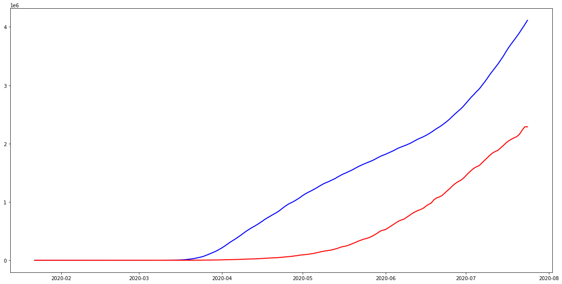
Now that the data are in long format, we can convert the Date field to datetime format and plot the time series. The below chart will plot the number of confirmed cases for the US and Brazil over time.
import matplotlib.pyplot as plt

df_melted['Date'] = pd.to_datetime(df_melted['Date'])
us = df_melted.loc[df_melted['Country/Region'] == 'US']
br = df_melted.loc[df_melted['Country/Region'] == 'Brazil']
plt.plot( 'Date', 'Confirmed', data=us, marker='', color='blue', linewidth=2)
plt.plot( 'Date', 'Confirmed', data=br, marker='', color='red', linewidth=2)
Matt Clarke, Tuesday, March 02, 2021


Other posts you might like

How to use the Pandas truncate() function
Have you ever needed to chop the top or bottom off a Pandas dataframe, or extract a specific section from the middle? If so, there’s a Pandas function called truncate()...

How to use Spacy for noun phrase extraction
Noun phrase extraction is a Natural Language Processing technique that can be used to identify and extract noun phrases from text. Noun phrases are phrases that function grammatically as nouns...