How to visualise conversion funnels with Plotly
Funnels are one of the most useful and intuitive data visualisations used in ecommerce and marketing. Here's a quick guide to creating them using Plotly.

Funnels are arguably one of the most powerful data visualisations you can use within the ecommerce field. At a glance, they can show you the proportion of customers entering at the top of your conversion funnel as new site visitors, and show how they drop off at each stage.
| Funnel stage | Description |
|---|---|
| Sessions | Sessions (or visits) represent the top of your conversion funnel. The more people you can get to visit, the more transactions you'll likely get at the bottom of the funnel. |
| Viewed product | Since you need to view a product to purchase it, you'll want to generate traffic that results in product page views. Blogs, for example, often generate traffic that never sees a product page, so this is an important first step. |
| Added product | Once customers are on the product page, you need to get them to add it to their basket. The picture needs to be alluring, the information needs to cover everything a customer needs to know before buying, the price needs to be right, and it needs to be in stock. |
| Reached checkout | Next, you need to get the customer through the checkout. Usability is vital. The process needs to go smoothly, the delivery charge needs to be appropriate for the product being purchased (i.e. cheap on small items, free on larger items). |
| Transactions | Finally, optimisations to all of the above steps mean more customers reaching the final stage of the funnel. |
Not only can funnels be created to show the volumes of customers going through a particular process, but they can also be segmented. This is important, since each traffic source generates traffic with different characteristics and will pass through the funnel differently. Funnels aren’t easy to make in typical data visualisation packages, such as Matplotlib or Seaborn, but Plotly and Ploty Express make them very straightforward. Here’s how it’s done.
Load the packages
Open a Jupyter notebook and load the pandas and plotly packages. If you need to install them, you can do this by entering pip3 install package-name.
import pandas as pd
import plotly.express as px
Create an area funnel
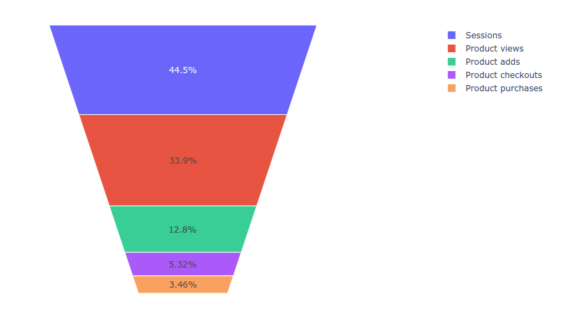
The simplest funnel is called an area funnel. It’s funnel-shaped and shows the percentage of customers who dropped out of the funnel stage - a value of 50% means half of the sessions resulted in the customer exiting the funnel.
Area funnels are very simple to create. Simply pass two lists to the funnel_area() function, one containing the names for each funnel step and one containing the values to use for each step in the funnel.
fig = px.funnel_area(names=['Sessions', 'Product views', 'Product adds',
                    'Product checkouts', 'Product purchases'],
                    values=[7008,5340,2012,837,545])
fig.show()
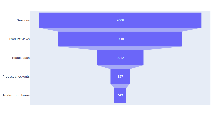
Create a stepped funnel
Stepped funnels can be used to show the number of sessions reaching each stage of a funnel, rather than the percentage. These are created using the funnel() function which requires a dictionary containing values and labels that can be created from the lists using dict().
data = dict(values=[7008,5340,2012,837,545],
            labels=['Sessions', 'Product views', 'Product adds',
                    'Product checkouts', 'Product purchases'])

fig = px.funnel(data,
                y='labels',
                x='values')
fig.show()
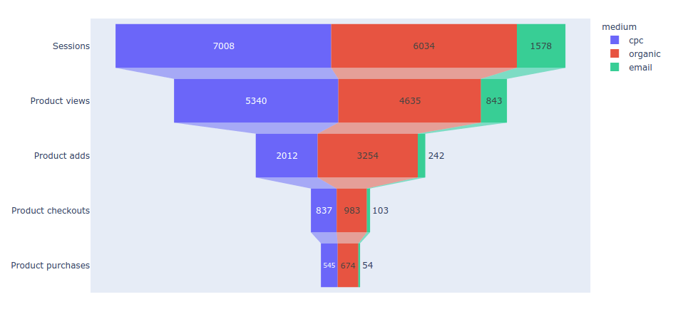
Create a segmented stepped funnel
Finally, there’s the segmented stepped funnel. This is also created using the funnel() function, but takes an additional argument called color that can be used to split each layer of the funnel to show the breakdown by a categorical variable.
With this funnel, it’s probable that you’ll need to fetch your raw data in separate dataframes, so I’ve shown how to do this below. We’ll create three dataframes - one for cpc, organic, and email, and will add the stage name as a column value, along with the number, and the name of the color which is set to medium.
stages = ['Sessions', 'Product views', 'Product adds',
          'Product checkouts', 'Product purchases']

df_cpc = pd.DataFrame(dict(number=[7008, 5340, 2012, 837, 545], stage=stages))
df_cpc['medium'] = 'cpc'

df_organic = pd.DataFrame(dict(number=[6034, 4635, 3254, 983, 674], stage=stages))
df_organic['medium'] = 'organic'

df_email = pd.DataFrame(dict(number=[1578, 843, 242, 103, 54], stage=stages))
df_email['medium'] = 'email'

df = pd.concat([df_cpc, df_organic, df_email], axis=0)
df.head(10)
| number | stage | medium | |
|---|---|---|---|
| 0 | 7008 | Sessions | cpc |
| 1 | 5340 | Product views | cpc |
| 2 | 2012 | Product adds | cpc |
| 3 | 837 | Product checkouts | cpc |
| 4 | 545 | Product purchases | cpc |
| 0 | 6034 | Sessions | organic |
| 1 | 4635 | Product views | organic |
| 2 | 3254 | Product adds | organic |
| 3 | 983 | Product checkouts | organic |
| 4 | 674 | Product purchases | organic |
fig = px.funnel(df, x='number', y='stage', color='medium')
fig.show()
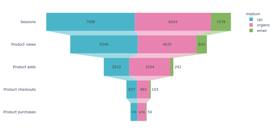
Customising funnel appearance
As with other data visualisation packages, Plotly allows you to customise the appearance of the plots created. To improve the aesthetics of the plots above I’ve set the background colour to white with fig.update_layout(plot_bgcolor='#fff') and have passed in a discrete_color_map dictionary, which defines the colour to use for each of the medium labels.
fig = px.funnel(df,
                x='number',
                y='stage',
                color='medium',
                color_discrete_map={"cpc": "#32B5C9",
                                    "organic": "#ED85B0",
                                    "email": "#81B361"},
               )

fig.update_layout(plot_bgcolor='#fff')
fig.show()
Matt Clarke, Monday, March 08, 2021


Other posts you might like

How to use the Pandas truncate() function
Have you ever needed to chop the top or bottom off a Pandas dataframe, or extract a specific section from the middle? If so, there’s a Pandas function called truncate()...

How to use Spacy for noun phrase extraction
Noun phrase extraction is a Natural Language Processing technique that can be used to identify and extract noun phrases from text. Noun phrases are phrases that function grammatically as nouns...