How to visualise correlations using Pandas and Seaborn
Machine learning models make predictions from correlations between features and the target, so finding correlated features is crucial. Here's how to do it.

Pearson’s product-moment correlation, or Pearson’s r, is a statistical method commonly used in data science to measure the strength of the linear relationship between variables. If you can identify existing features, or engineer new ones, that either have a strong correlation with your target variable, you can help improve your model’s performance.
The Pearson correlation coefficient examines two variables, X and y, and returns a value between -1 and 1, indicating the strength of their linear correlation. A value of -1 is a perfect negative correlation, a value of exactly 0 indicates no correlation, while a value of 1 indicates a perfect positive correlation.
Since Pearson’s R shows a linear relationship, you can visualise the relationships between variables using scatter plots with regression lines fitted. A regression line that slopes upwards to the right indicates a strong positive correlation, a regression line that slopes downwards to the left indicates a strong negative correlation, while a flat line indicates no correlation.
Let’s take a look at some simple ways you can measure the correlation between variables within your data set, and examine their specific relationships to the target variable your model is aiming to predict.
Load the packages
For this project we’ll be using Pandas and Numpy for loading and manipulating data, and Matplotlib and Seaborn for creating visualisations to help us identify correlations between the variables.
import pandas as pd
import numpy as np
import matplotlib.pyplot as plt
import seaborn as sns
Load the data
You can use any data you like, but I’m using the California Housing data set. You can download this directly from my GitHub using the Pandas read_csv() function and then display the data in a transposed Pandas dataframe using df.head().T.
df = pd.read_csv('https://raw.githubusercontent.com/flyandlure/datasets/master/housing.csv')
df.head().T
| 0 | 1 | 2 | 3 | 4 | |
|---|---|---|---|---|---|
| longitude | -122.23 | -122.22 | -122.24 | -122.25 | -122.25 |
| latitude | 37.88 | 37.86 | 37.85 | 37.85 | 37.85 |
| housing_median_age | 41 | 21 | 52 | 52 | 52 |
| total_rooms | 880 | 7099 | 1467 | 1274 | 1627 |
| total_bedrooms | 129 | 1106 | 190 | 235 | 280 |
| population | 322 | 2401 | 496 | 558 | 565 |
| households | 126 | 1138 | 177 | 219 | 259 |
| median_income | 8.3252 | 8.3014 | 7.2574 | 5.6431 | 3.8462 |
| median_house_value | 452600 | 358500 | 352100 | 341300 | 342200 |
| ocean_proximity | NEAR BAY | NEAR BAY | NEAR BAY | NEAR BAY | NEAR BAY |
Engineer additional features
At the moment, some of the most useful features are currently categorical variables. To examine their correlation to the target variable median_house_price, these need to be transformed into numeric variables. To do this we’ll use the one-hot encoding technique via the Pandas get_dummies() function. Converting the column values to lowercase and slugifying them keeps the column names created a bit neater.
df['ocean_proximity'] = df['ocean_proximity'].str.lower().replace('[^0-9a-zA-Z]+','_',regex=True)
encodings = pd.get_dummies(df['ocean_proximity'], prefix='proximity')
df = pd.concat([df, encodings], axis=1)
df.sample(5).T
| 2517 | 15071 | 8775 | 12352 | 17142 | |
|---|---|---|---|---|---|
| longitude | -122.16 | -116.98 | -118.31 | -116.54 | -122.18 |
| latitude | 39.78 | 32.79 | 33.8 | 33.81 | 37.45 |
| housing_median_age | 32 | 32 | 29 | 31 | 43 |
| total_rooms | 1288 | 3756 | 2795 | 6814 | 2061 |
| total_bedrooms | 221 | 662 | 572 | 1714 | 437 |
| population | 562 | 1611 | 1469 | 2628 | 817 |
| households | 203 | 598 | 557 | 1341 | 385 |
| median_income | 2.325 | 3.8667 | 3.7167 | 2.1176 | 4.4688 |
| median_house_value | 69600 | 189700 | 308900 | 124100 | 460200 |
| ocean_proximity | inland | _1h_ocean | _1h_ocean | inland | near_bay |
| proximity__1h_ocean | 0 | 1 | 1 | 0 | 0 |
| proximity_inland | 1 | 0 | 0 | 1 | 0 |
| proximity_island | 0 | 0 | 0 | 0 | 0 |
| proximity_near_bay | 0 | 0 | 0 | 0 | 1 |
| proximity_near_ocean | 0 | 0 | 0 | 0 | 0 |
Calculate correlation to the target variable
The first way to calculate and examine correlations is to do it via Pandas. This comes with a function called corr() which calculates the Pearson correlation. If you provide the name of the target variable column median_house_value and then sort the values in descending order, Pandas will show you the features in order of correlation with the target.
At the top we have a very strong positive correlation with median_income - the higher this value, the higher the value of the house. At the bottom we have a strong negative correlation with proximity_inland - the further inland, the lower the house value. The values that are close to zero may not add a great deal individually, but often contribute when combined with other variables.
df[df.columns[1:]].corr()['median_house_value'][:].sort_values(ascending=False).to_frame()
| median_house_value | |
|---|---|
| median_house_value | 1.000000 |
| median_income | 0.688075 |
| proximity__1h_ocean | 0.256617 |
| proximity_near_bay | 0.160284 |
| proximity_near_ocean | 0.141862 |
| total_rooms | 0.134153 |
| housing_median_age | 0.105623 |
| households | 0.065843 |
| total_bedrooms | 0.049686 |
| proximity_island | 0.023416 |
| population | -0.024650 |
| latitude | -0.144160 |
| proximity_inland | -0.484859 |
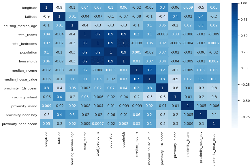
Create a correlation heatmap
To visualise the correlations between all variables, not just the target variable, you can create a correlation matrix. This is essentially the same as the dataframe above, but with a row for each variable, and a neat colour coding scheme that allows you to see which values are most positively or negatively correlated based on the depth of their colour. Pale cells denote values with a negative correlation, while dark cells denote a stronger positive correlation. The fmt='.1g' argument reduces the number of decimal points, where it’s feasible to do so, to aid readability.
plt.figure(figsize=(14,8))
sns.set_theme(style="white")
corr = df.corr()
heatmap = sns.heatmap(corr, annot=True, cmap="Blues", fmt='.1g')
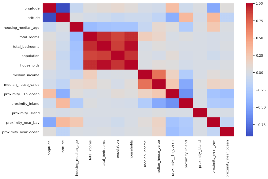
If you find it easier to read without the annotations showing the Pearson correlation score, you can remove the annot=True argument from the Seaborn heatmap() function and get a more minimalist plot. You can also change the colour map by using a different value in the cmap argument.
plt.figure(figsize=(14,8))
sns.set_theme(style="white")
corr = df.corr()
heatmap = sns.heatmap(corr, cmap="coolwarm")
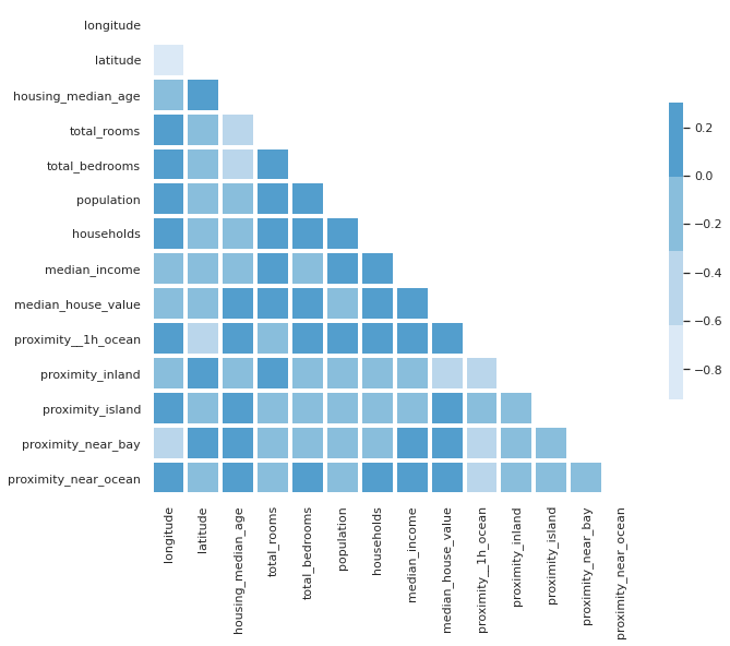
Diagonal correlation matrix
If you look closely at the correlation matrix above, you’ll notice that the data are repeated either side of the diagonal row. To get rid of the diagonal row, which shows the correlation of the variable with itself, and is therefore always 1, you can use a mask technique and some funky Numpy code to blank the cells out. To my eye, the diagonal correlation matrix is much easier to read.
sns.set_theme(style="white")
corr = df.corr()
mask = np.triu(df.corr())
f, ax = plt.subplots(figsize=(10, 10))
cmap = sns.color_palette("Blues")

sns.heatmap(corr,
            mask=mask,
            cmap=cmap,
            vmax=.3,
            center=0,
            square=True,
            linewidths=3,
            cbar_kws={"shrink": .5}
           )
<matplotlib.axes._subplots.AxesSubplot at 0x7f749ffc02e0>
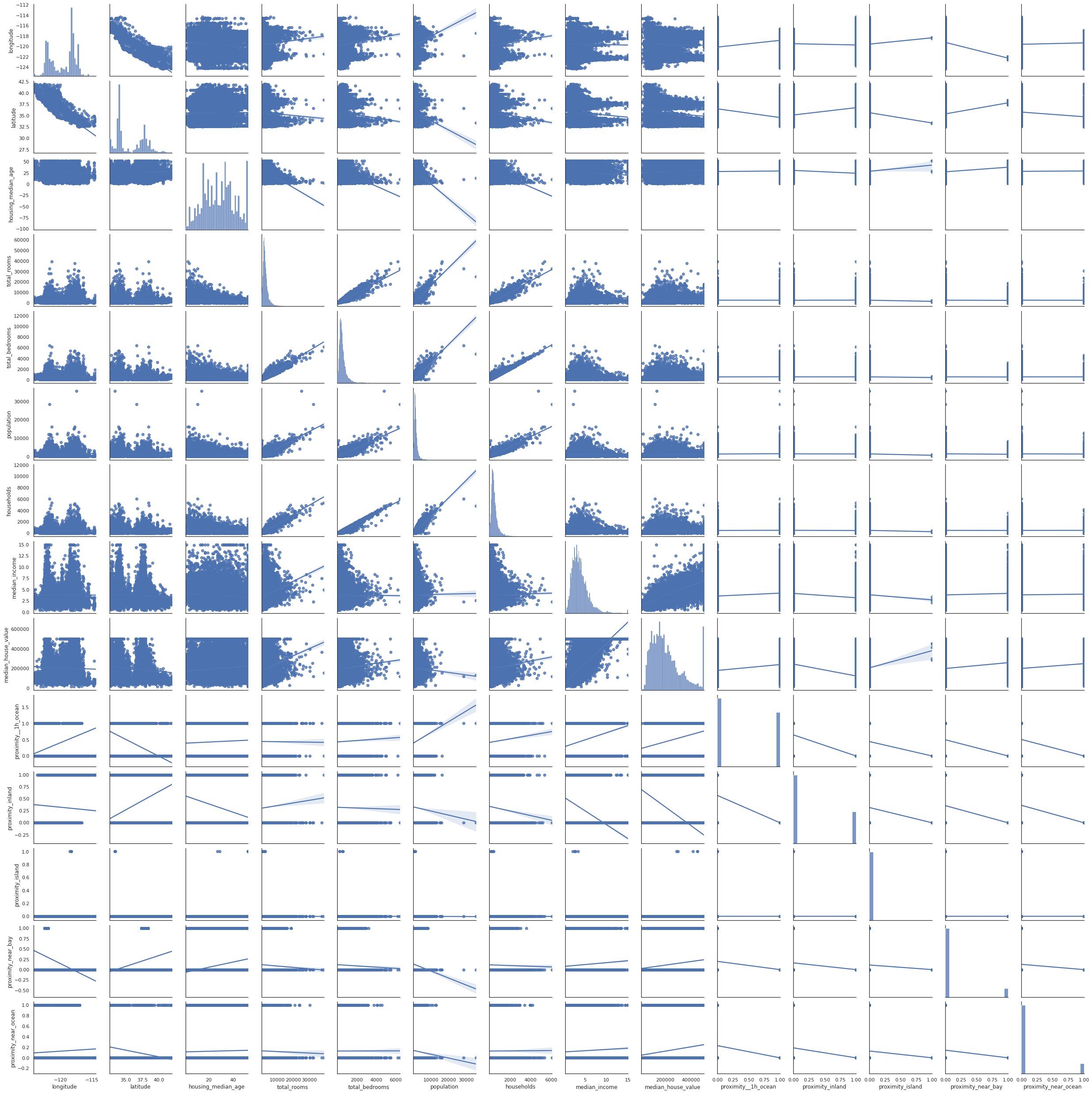
Pairplots
Pairplots are also a useful to examine the relationships between data. The snag with these, however, is that they produce truly massive plots on larger datasets that can take some time to generate. Adding the kind="reg" argument adds a regression line to make spotting trends a bit easier.
sns.pairplot(df, kind="reg")
<seaborn.axisgrid.PairGrid at 0x7f749ffbeb20>
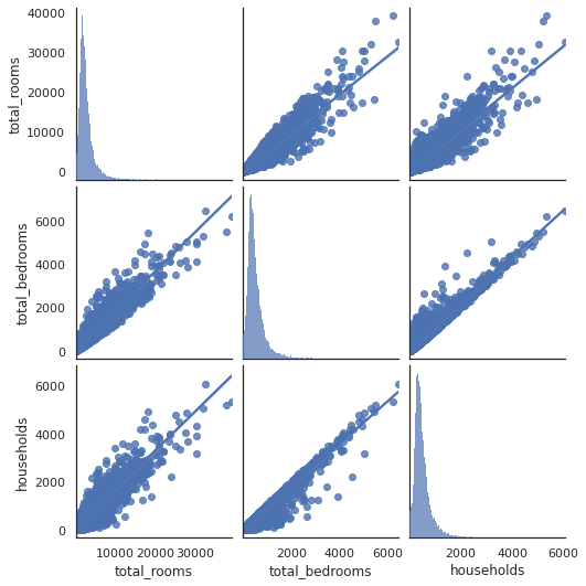
Examining subsets of variables
To work around the issue of massive and unreadable pairplots, you can split up your data frame and examine variables in batches, or you can create individual scatterplots to examine relationships of interest. For example, let’s look at total_rooms, total_bedrooms, and households. They are all positively correlated and could be collinear, so they may not all be required in the model.
plt.figure(figsize=(14,8))
sns.pairplot(df[['total_rooms','total_bedrooms','households']], kind="reg")
<seaborn.axisgrid.PairGrid at 0x7f749461bac0>


<Figure size 1008x576 with 0 Axes>
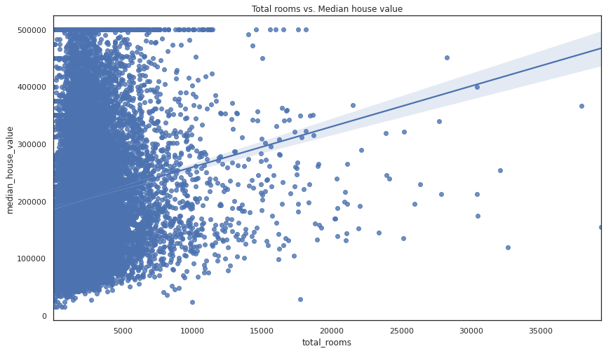
Examining pairs of variables
If you want to examine a specific pair of variables you can create a scatterplot using the regplot() function. This accepts an X and y argument consisting of the respective dataframe columns.
plt.figure(figsize=(14,8))
sns.regplot(x=df["total_rooms"], y=df["median_house_value"])
plt.title('Total rooms vs. Median house value')
Text(0.5, 1.0, 'Total rooms vs. Median house value')
Matt Clarke, Sunday, March 07, 2021


Other posts you might like

How to use the Pandas truncate() function
Have you ever needed to chop the top or bottom off a Pandas dataframe, or extract a specific section from the middle? If so, there’s a Pandas function called truncate()...

How to use Spacy for noun phrase extraction
Noun phrase extraction is a Natural Language Processing technique that can be used to identify and extract noun phrases from text. Noun phrases are phrases that function grammatically as nouns...