How to visualise data using boxplots in Seaborn
The Seaborn boxplot, or box-and-whisker diagram, is a great way to visualise the statistical distribution of data. Here’s how you create them.

The boxplot, or box-and-whisker diagram, is one of the most useful ways to visualise statistical distributions in data. While they can seem a bit unintuitive when you first look at them, boxplots actually tell you a great deal about the underlying data and are fairly easy to interpret when you know how.
How to interpret a boxplot
A boxplot divides data into quartiles, with the box representing the interquartile range. The mid-line of the box (which isn’t always central) represents the median; the top of the box represents the upper quartile (Q3), and the bottom represents the lower quartile (Q1).
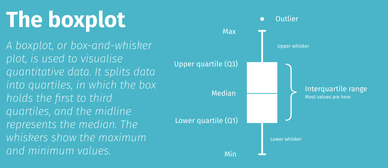
The lines at the top and bottom are called whiskers and represent the tail of the data either side of the interquartile range. The ends of the whiskers represent the minimum and maximum values in the data set, although outliers often appear just off the edges.
The boxplot (or boxplots) are shown on an axis to show where the values lie. A short boxplot means the data are concentrated around a smaller range, while a longer boxplot and longer whiskers, indicating a broader range and longer tails.
Load the packages
For this project we’ll be using Pandas for viewing dataframes of raw data and Seaborn for visualising the data in boxplots. Seaborn is a wrapper around Matplotlib and makes it much quicker and easier to create aesthetically pleasing data visualisations. To make these a bit sharper on retina or 4K displays, we will pass in a couple of custom settings to increase the pixel density.
import pandas as pd
import seaborn as sns
%config InlineBackend.figure_format = 'retina'
sns.set_context('notebook')
Load the data
Seaborn comes with a couple of datasets which are ideal for plotting data using boxplots. The Iris data set included taxonomic data on the measurements of iris foliage, while the Tips data set includes tips made by restaurant diners. We’ll load each data set into a named dataframe.
df_iris = sns.load_dataset('iris')
df_iris.head()
| sepal_length | sepal_width | petal_length | petal_width | species | |
|---|---|---|---|---|---|
| 0 | 5.1 | 3.5 | 1.4 | 0.2 | setosa |
| 1 | 4.9 | 3.0 | 1.4 | 0.2 | setosa |
| 2 | 4.7 | 3.2 | 1.3 | 0.2 | setosa |
| 3 | 4.6 | 3.1 | 1.5 | 0.2 | setosa |
| 4 | 5.0 | 3.6 | 1.4 | 0.2 | setosa |
df_tips = sns.load_dataset('tips')
df_tips.head()
| total_bill | tip | sex | smoker | day | time | size | |
|---|---|---|---|---|---|---|---|
| 0 | 16.99 | 1.01 | Female | No | Sun | Dinner | 2 |
| 1 | 10.34 | 1.66 | Male | No | Sun | Dinner | 3 |
| 2 | 21.01 | 3.50 | Male | No | Sun | Dinner | 3 |
| 3 | 23.68 | 3.31 | Male | No | Sun | Dinner | 2 |
| 4 | 24.59 | 3.61 | Female | No | Sun | Dinner | 4 |
Single boxplot
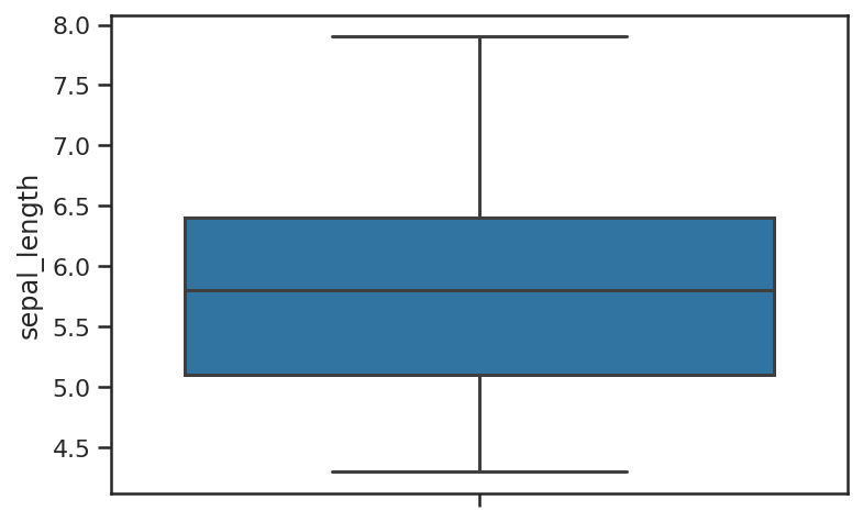
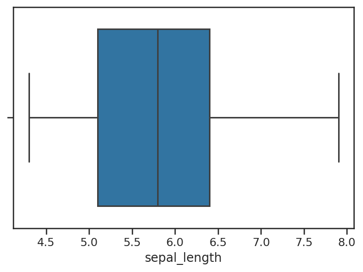
To create a single boxplot, all you need to do is call the boxplot() function and pass in the y argument with the Pandas dataframe column you wish to plot. By default, Seaborn uses vertical boxplots, but you can change these to horizontal by passing in the argument orient='h'.
sns.boxplot(y=df_iris["sepal_length"])
sns.boxplot(y=df_iris["sepal_length"], orient='h')
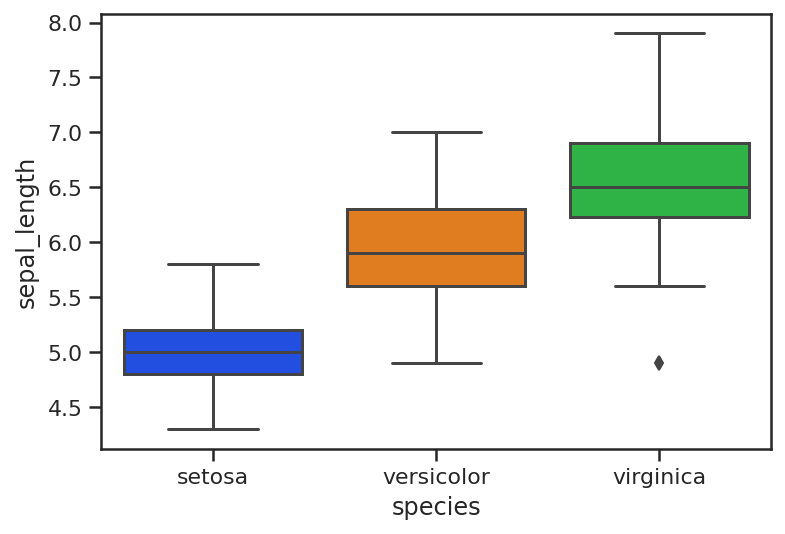
Grouped boxplot
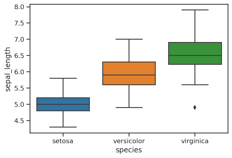
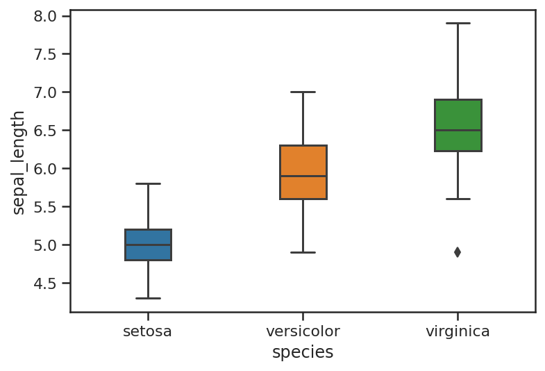
It is grouped boxplots which are arguably most useful. These are also very easy to create in Seaborn. These require two columns from your Pandas dataframe. The X column contains the class for each of the rows of data (i.e. the species in the Iris dataset), while the y column contains the metric you wish to plot (i.e. sepal_length). You get back a boxplot for each class found, with the position of the plot on the axis denoting where the points lie.
sns.boxplot(x=df_iris["species"],
            y=df_iris["sepal_length"])
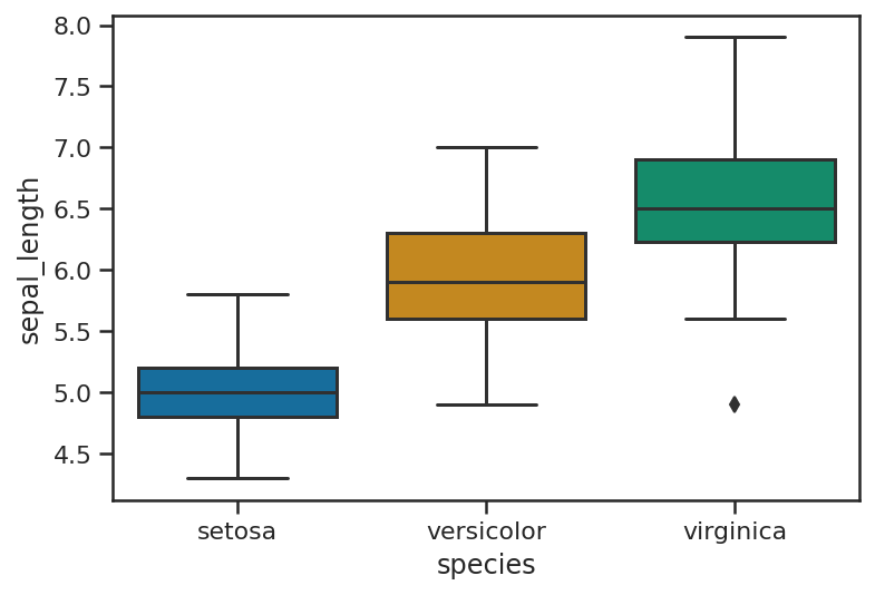
Boxplot theming
Seaborn provides a number of standard themes that you can apply to boxplots and any other Seaborn visualisations. To load these you simply call the set_style() function and pass in the name of the theme. Here are the main Seaborn themes.
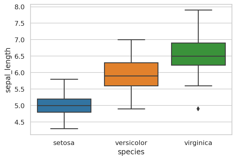
Whitegrid theme
sns.set_style("whitegrid")
sns.boxplot(x=df_iris["species"],
            y=df_iris["sepal_length"])
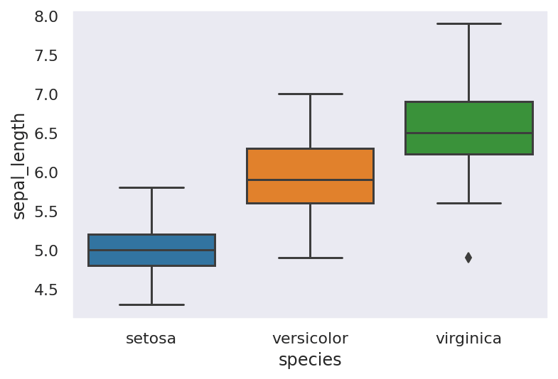
Dark theme
sns.set_style("dark")
sns.boxplot(x=df_iris["species"],
            y=df_iris["sepal_length"])
White theme
sns.set_style("white")
sns.boxplot(x=df_iris["species"],
            y=df_iris["sepal_length"])

Ticks theme
sns.set_style("ticks")
sns.boxplot(x=df_iris["species"],
            y=df_iris["sepal_length"])

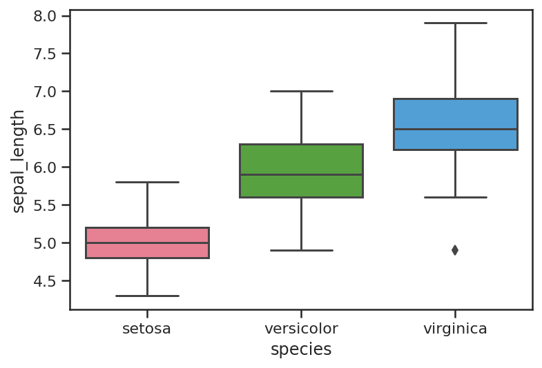
Boxplot colour palettes
Seaborn comes with loads of different standard colour palettes that you can load by passing in the palette name as an argument when calling the boxplot() function. Some of the main Seaborn colour palettes are shown below, but there are loads more on the Seaborn website.
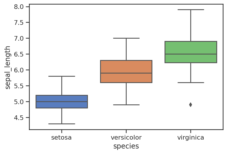
Deep
sns.boxplot(x=df_iris["species"],
            y=df_iris["sepal_length"],
            palette="deep")

Muted
sns.boxplot(x=df_iris["species"],
            y=df_iris["sepal_length"],
            palette="muted")
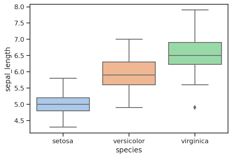
Pastel
sns.boxplot(x=df_iris["species"],
            y=df_iris["sepal_length"],
            palette="pastel")
Bright
sns.boxplot(x=df_iris["species"],
            y=df_iris["sepal_length"],
            palette="bright")
Colorblind
sns.boxplot(x=df_iris["species"],
            y=df_iris["sepal_length"],
            palette="colorblind")
Husl (HSLuv)
sns.boxplot(x=df_iris["species"],
            y=df_iris["sepal_length"],
            palette="husl")
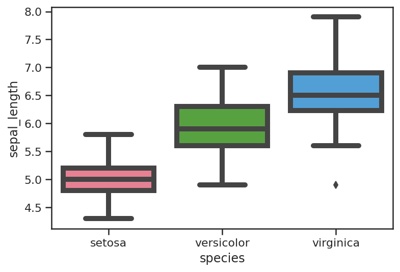
Boxplot styling
You can also control the width of the boxplots and the width of the line thickness, which can make them clearer to read on Powerpoint presentations. The thickness of the boxplot lines is controlled via the linewidth argument, while the boxplot width is controlled via width.
sns.boxplot(x=df_iris["species"],
            y=df_iris["sepal_length"],
            linewidth=5,
            palette="husl")
sns.boxplot(x=df_iris["species"],
            y=df_iris["sepal_length"],
            width=0.3)
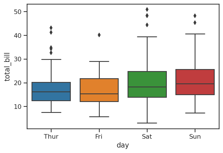
Viewing outliers with boxplots
If you have outliers in your data set, you’ll see a line of dots or diamonds above the top whisker. This alone is a very good reason to create boxplots when you’re building models, as it’s these outliers that can often throw a model off track.
sns.boxplot(x="day", y="total_bill", data=df_tips)
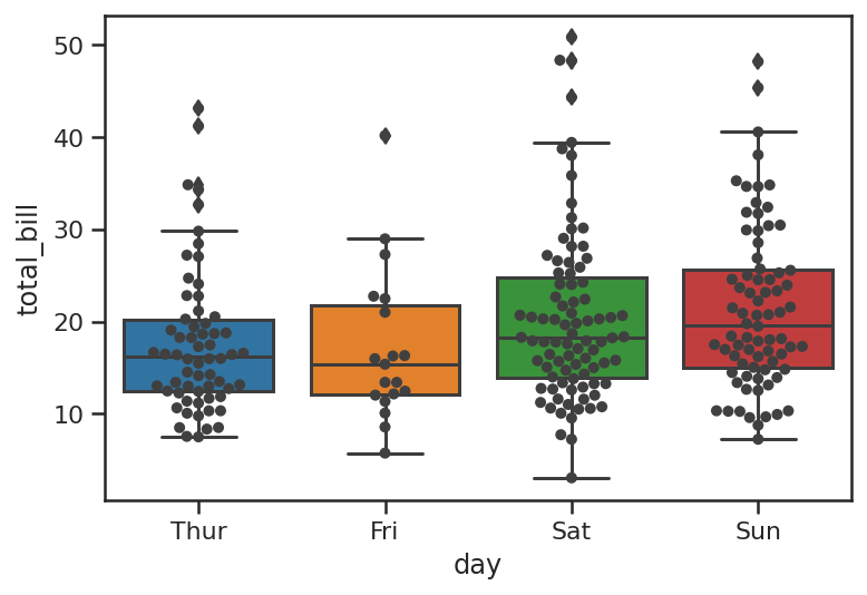
The swarmplot or beeswarm plot is a related visualisation and can work well when plotted on top of a boxplot or violinplot. Cleverly, the points are aligned so they don’t overlap, but they only really work on datasets with smaller numbers of observations. Violinplots do a similar thing and scale better to larger volumes of data.
ax = sns.boxplot(x="day", y="total_bill", data=df_tips)
ax = sns.swarmplot(x="day", y="total_bill", data=df_tips, color=".25")
Matt Clarke, Saturday, March 06, 2021


Other posts you might like

How to use the Pandas truncate() function
Have you ever needed to chop the top or bottom off a Pandas dataframe, or extract a specific section from the middle? If so, there’s a Pandas function called truncate()...

How to use Spacy for noun phrase extraction
Noun phrase extraction is a Natural Language Processing technique that can be used to identify and extract noun phrases from text. Noun phrases are phrases that function grammatically as nouns...