How to create a linear regression model using Scikit-Learn
Want to get started with sklearn linear regression? Learn to use Python, Pandas, and scikit-learn to create a linear regression model to predict house prices.

Linear regression models are widely used in every industry. They predict a number from a range of other features based on a linear relationship between the input variables (X) and the output variable (y).
Linear models are quick and easy to build and can work very well when properly tuned. You can use them for almost anything, from predicting the value of stocks and shares, to forecasting tomorrow’s weather.
In this project we’re going to build a really simple linear regression model to predict the value of housing in California. At the end, you should be able to apply the same techniques for creating linear models to examine the data of your choice.
Load the packages
Open a new Jupyter notebook and enter the lines below to load the packages we’ll be using for this simple project. If you don’t have the packages installed already, you can install them from within your Jupyter notebook by entering !pip3 install pandas (where pandas is the name of the missing package) and then executing the code cell by holding shift and pressing enter.
import pandas as pd
import numpy as np
import seaborn as sns
import matplotlib.pyplot as plt
from pandas.plotting import scatter_matrix
from sklearn.preprocessing import LabelEncoder
from sklearn.preprocessing import StandardScaler
from sklearn.model_selection import train_test_split
from sklearn.linear_model import LinearRegression
from sklearn.metrics import mean_squared_error
Load the data
The data set we’re using is a Kaggle data set which includes details on house prices in different parts of California. We’ll be using the features in here (such as the latitude and longitude, number of rooms, and the proximity to the ocean) to predict the median_house_value using a linear regression model.
We’ll use the Pandas read_csv() function to load our data set into a dataframe called df, and then print the first five lines of the file using df.head(). I’ve used the .T suffix to transpose the data so it fits better on the page.
df = pd.read_csv('https://raw.githubusercontent.com/flyandlure/datasets/master/housing.csv')
df.head().T
| 0 | 1 | 2 | 3 | 4 | |
|---|---|---|---|---|---|
| longitude | -122.23 | -122.22 | -122.24 | -122.25 | -122.25 |
| latitude | 37.88 | 37.86 | 37.85 | 37.85 | 37.85 |
| housing_median_age | 41 | 21 | 52 | 52 | 52 |
| total_rooms | 880 | 7099 | 1467 | 1274 | 1627 |
| total_bedrooms | 129 | 1106 | 190 | 235 | 280 |
| population | 322 | 2401 | 496 | 558 | 565 |
| households | 126 | 1138 | 177 | 219 | 259 |
| median_income | 8.3252 | 8.3014 | 7.2574 | 5.6431 | 3.8462 |
| median_house_value | 452600 | 358500 | 352100 | 341300 | 342200 |
| ocean_proximity | NEAR BAY | NEAR BAY | NEAR BAY | NEAR BAY | NEAR BAY |
Check the data types
Our model needs to have numeric data from which to make its predictions, so we’ll use the df.info() command to examine the data types by column. Everything looks fine, as we mostly have float64 numeric data, apart from in the ocean_proximity column which contains a text string Pandas classifies as an object data type. This is known as a categorical variable.
df.info()
<class 'pandas.core.frame.DataFrame'>
RangeIndex: 20640 entries, 0 to 20639
Data columns (total 10 columns):
 #   Column              Non-Null Count  Dtype
---  ------              --------------  -----
 0   longitude           20640 non-null  float64
 1   latitude            20640 non-null  float64
 2   housing_median_age  20640 non-null  float64
 3   total_rooms         20640 non-null  float64
 4   total_bedrooms      20433 non-null  float64
 5   population          20640 non-null  float64
 6   households          20640 non-null  float64
 7   median_income       20640 non-null  float64
 8   median_house_value  20640 non-null  float64
 9   ocean_proximity     20640 non-null  object
dtypes: float64(9), object(1)
memory usage: 1.6+ MB
Encode the categorical variable
The categorical variable ocean_proximity needs to be turned into a numeric value so it can be used by our model. There are several ways we could “encode” the data within, but choosing the right solution depends on the underlying data. Specifically, we need to understand the “cardinality” of the column and identify how many unique values it holds, which we can do by appending .value_counts() to the ocean_proximity column of our dataframe.
df['ocean_proximity'].value_counts()
<1H OCEAN     9136
INLAND        6551
NEAR OCEAN    2658
NEAR BAY      2290
ISLAND           5
Name: ocean_proximity, dtype: int64
The value_counts() function reveals that we have quite low cardinality, with just five unique values across this column. This is well suited to a categorical variable encoding technique called one-hot encoding. One-hot encoding basically “binarises” the data and adds new columns with a value of 1 or 0, depending on whether a row matches. This will give us five new columns on our dataframe, with four set to 0 and one set to 1.
The one-hot encoding step is handled for us by a Pandas function called get_dummies(). This takes the column values (i.e. NEAR OCEAN) and uses them in the column name. That often doesn’t look very neat, so I prefer to “slugify” the column values first by converting them to lowercase letters and stripping out any other characters.
df['ocean_proximity'] = df['ocean_proximity'].str.lower().replace('[^0-9a-zA-Z]+','_',regex=True)
Now the column values have been tidied up, we will use get_dummies() to one-hot encode the data and prefix all the new columns with proximity so they’re easier to identify. The one-hot encodings get assigned to a dataframe called encodings which we will then concatenate (or join) to the side of the df dataframe. If we then print a sample of five random rows we’ll see the new columns.
encodings = pd.get_dummies(df['ocean_proximity'], prefix='proximity')
df = pd.concat([df, encodings], axis=1)
df.sample(5).T
| 10548 | 12365 | 6490 | 7303 | 15707 | |
|---|---|---|---|---|---|
| longitude | -117.77 | -116.47 | -118.01 | -118.19 | -122.43 |
| latitude | 33.7 | 33.81 | 34.1 | 33.98 | 37.79 |
| housing_median_age | 3 | 7 | 35 | 40 | 50 |
| total_rooms | 3636 | 10105 | 2120 | 973 | 3312 |
| total_bedrooms | 749 | 2481 | 412 | 272 | 1095 |
| population | 1486 | 6274 | 1375 | 1257 | 1475 |
| households | 696 | 2095 | 405 | 258 | 997 |
| median_income | 5.5464 | 2.4497 | 3.4609 | 2.8214 | 2.7165 |
| median_house_value | 207500 | 90900 | 166300 | 158000 | 500001 |
| ocean_proximity | _1h_ocean | inland | inland | _1h_ocean | near_bay |
| proximity__1h_ocean | 1 | 0 | 0 | 1 | 0 |
| proximity_inland | 0 | 1 | 1 | 0 | 0 |
| proximity_island | 0 | 0 | 0 | 0 | 0 |
| proximity_near_bay | 0 | 0 | 0 | 0 | 1 |
| proximity_near_ocean | 0 | 0 | 0 | 0 | 0 |
Exploratory Data Analysis
The next step is called Exploratory Data Analysis or EDA. This is designed to help you understand the data to see what further work may be required to transform it for use by the model. The basics are quite straightforward, but in-depth EDA does require detailed knowledge of statistics and the ways in which models work, so we’ll sidestep this a bit for simplicity and just cover the basic principles instead.
Visualise the data with histograms
One of the most useful first steps with any new data set is to examine the spread of the data (or the statistical distribution) by using Pandas to plot histograms. Histograms are basically bar charts which automatically “bin” the data. This removes a bit of the detail (depending on the number of bins you use) and can be a good way to get an overview of where the data lie. The two lines of code below handle all of this for us.
df.hist(bins=50, figsize=(20,15))
plt.show()
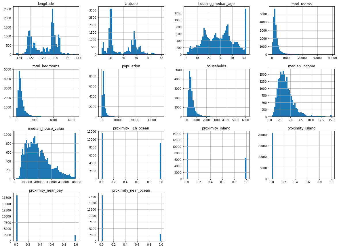
The histograms for the proximity data we one-hot encoded show that it’s binary, as there are only values at either end. The other data are distributed either with a left skew (i.e. mostly low values), or a more “normal” distribution where the values are spread out a bit more evenly.
Any big spikes that sit away from other points could represent outliers, or statistical anomalies. These can often throw a model off track. If you look at the housing_median_age histogram you can see a very clear spike around the 50 mark, which represents a clear outlier. We’ll skip the removal of this for now for simplicity, but doing so will give us an extra performance boost later on.
Examine the summary statistics
The summary statistics for the data cover its count, mean, standard deviation, minimum value, maximum value and the inter-quartile range. Ordinarily, by examining the values in here, you might choose to create other visualisations of individual columns to help you understand the data in more detail, but we’ll overlook this for now.
df.describe().T
| count | mean | std | min | 25% | 50% | 75% | max | |
|---|---|---|---|---|---|---|---|---|
| longitude | 20640.0 | -119.569704 | 2.003532 | -124.3500 | -121.8000 | -118.4900 | -118.01000 | -114.3100 |
| latitude | 20640.0 | 35.631861 | 2.135952 | 32.5400 | 33.9300 | 34.2600 | 37.71000 | 41.9500 |
| housing_median_age | 20640.0 | 28.639486 | 12.585558 | 1.0000 | 18.0000 | 29.0000 | 37.00000 | 52.0000 |
| total_rooms | 20640.0 | 2635.763081 | 2181.615252 | 2.0000 | 1447.7500 | 2127.0000 | 3148.00000 | 39320.0000 |
| total_bedrooms | 20433.0 | 537.870553 | 421.385070 | 1.0000 | 296.0000 | 435.0000 | 647.00000 | 6445.0000 |
| population | 20640.0 | 1425.476744 | 1132.462122 | 3.0000 | 787.0000 | 1166.0000 | 1725.00000 | 35682.0000 |
| households | 20640.0 | 499.539680 | 382.329753 | 1.0000 | 280.0000 | 409.0000 | 605.00000 | 6082.0000 |
| median_income | 20640.0 | 3.870671 | 1.899822 | 0.4999 | 2.5634 | 3.5348 | 4.74325 | 15.0001 |
| median_house_value | 20640.0 | 206855.816909 | 115395.615874 | 14999.0000 | 119600.0000 | 179700.0000 | 264725.00000 | 500001.0000 |
| proximity__1h_ocean | 20640.0 | 0.442636 | 0.496710 | 0.0000 | 0.0000 | 0.0000 | 1.00000 | 1.0000 |
| proximity_inland | 20640.0 | 0.317393 | 0.465473 | 0.0000 | 0.0000 | 0.0000 | 1.00000 | 1.0000 |
| proximity_island | 20640.0 | 0.000242 | 0.015563 | 0.0000 | 0.0000 | 0.0000 | 0.00000 | 1.0000 |
| proximity_near_bay | 20640.0 | 0.110950 | 0.314077 | 0.0000 | 0.0000 | 0.0000 | 0.00000 | 1.0000 |
| proximity_near_ocean | 20640.0 | 0.128779 | 0.334963 | 0.0000 | 0.0000 | 0.0000 | 0.00000 | 1.0000 |
Examine correlations with the target
Our linear regression model is going to predict the median_house_value based on the other features. In order to be able to do this, there needs to be some kind of mathematical relationship - or “correlation” - between the features and the target.
A clever statistical calculation called the Pearson product moment correlation is usually used to calculate this. It returns a “correlation coefficient”. If this is close to 1 then there’s a perfect correlation, if it’s close to 0 then there’s little or no correlation, while if it’s less than 1 there’s a negative correlation.
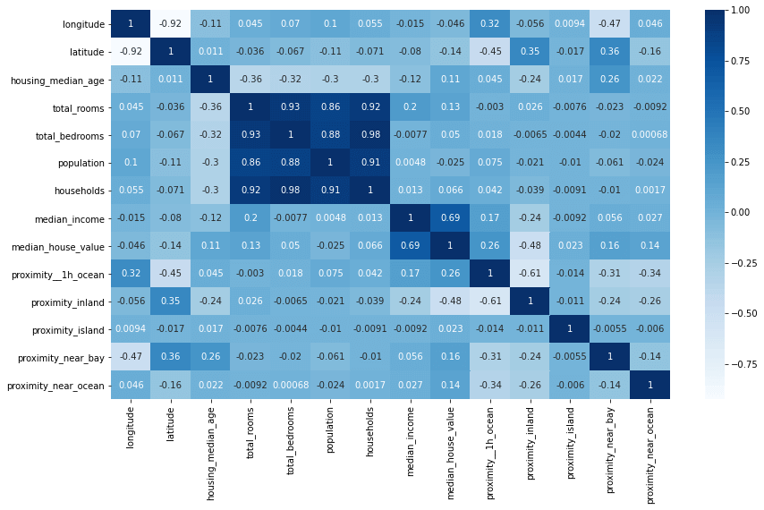
The three lines below create a heatmap correlation matrix showing these correlation coefficients for each pair of variables. You can see from the below that there’s a strong link between median_income and median_house_value, and that proximity__1h_ocean (properties within an hour of the ocean) are associated with a higher value. There should be some useful data here for our model to use.
plt.figure(figsize=(14,8))
corr = df.corr()
heatmap = sns.heatmap(corr, annot=True, cmap="Blues")
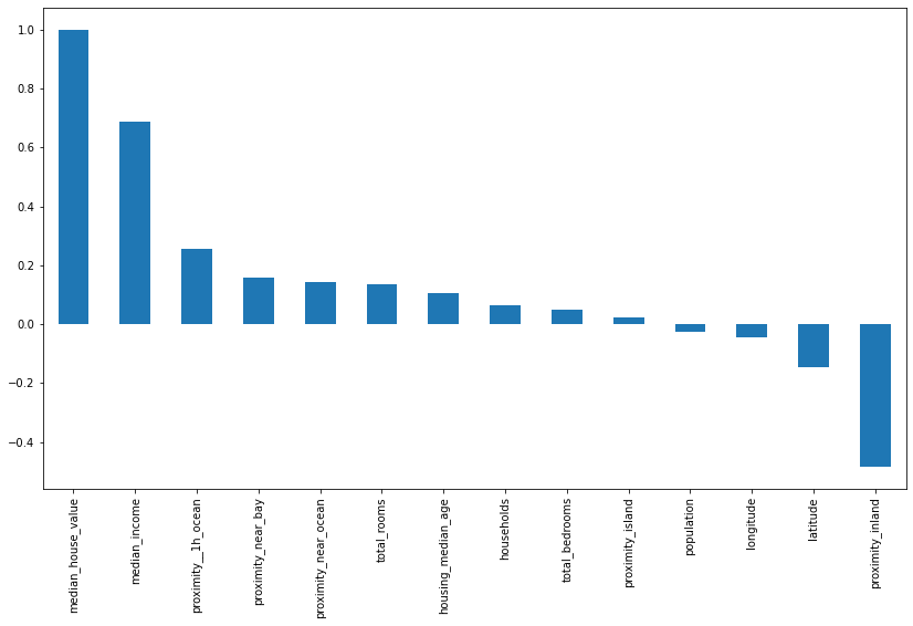
It can also be useful to plot the correlations on a bar chart. This shows the correlation coefficient for each column against the target column we’re trying to predict. There’s a clear positive link between income, proximity to the ocean, the Bay area, the number of rooms and the median age.
plt.figure(figsize=(14,8))
bars = df.corr()['median_house_value'].sort_values(ascending=False).plot(kind='bar')
Location, location, location
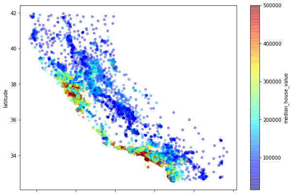
To check whether the location of the property makes a difference we can create a scatterplot of the latitude and longitude values which effectively creates a crude map of the locations of the houses. You can see that some areas have a higher density of values, denoting a higher population, but the really interesting bit is in the colour of the dots. By using a colour map (or cmap) set to the median_house_value column, we can see that it’s the houses along parts of the California coastline which have the highest median values.
df.plot(
    x='longitude', y='latitude',
    kind='scatter', figsize=(10,7),
    alpha=.4,
    c='median_house_value', cmap=plt.get_cmap('jet'), colorbar=True
)
<matplotlib.axes._subplots.AxesSubplot at 0x7f52780e0160>
Examine missing values
The other important step during EDA is to identify whether there are any missing values in the dataset. By default, these will be present as a NaN or null value and the model won’t be able to handle these. There are two main options when it comes to missing values, you can either drop them or “impute” them. Running df.isnull().sum() tells us we only have one column with missing values, which is total_bedrooms, where 207 of 20,640 rows have no value. Dropping these rows could throw away useful data, so instead, we’ll impute them or fill them in.
df.isnull().sum()
longitude                 0
latitude                  0
housing_median_age        0
total_rooms               0
total_bedrooms          207
population                0
households                0
median_income             0
median_house_value        0
ocean_proximity           0
proximity__1h_ocean       0
proximity_inland          0
proximity_island          0
proximity_near_bay        0
proximity_near_ocean      0
dtype: int64
Imputing missing values
Imputation or imputing is basically a clever way of filling in the gaps caused by missing data. This can often improve model performance quite a bit, but the impact will probably be quite small here as there are relatively few values missing. Zero imputation is an easy and effective way to fill in the gaps. By entering df = df.fillna(0), Pandas will fill in any NaN values it finds with zeroes. We could fill in the missing values with the mean for the column (via “mean imputation”) but this is a little more complex so we’ll keep things easy for now.
df = df.fillna(0)
Create the regression model
Define X and y
Now we’ve examined our data and fixed any issues, we need to create a data set to train the model and one to hold back for testing. The aim of the model is to predict our target variable y (which is the median_house_value) from the set of features X. The first step is therefore to define which columns go into X and y.
It’s vital that the X dataframe contains only numeric features so we will use the drop() function to remove the ocean_proximity column which is an object. The other crucial thing we need to do with X is drop the target column median_house_value from it, otherwise we’ll simply give the model the answer and it will make perfect predictions on the training data but won’t work on the test set.
X = df.drop(['median_house_value','ocean_proximity'], axis=1)
y = df['median_house_value']
Create the training and test datasets
The next step is to create the training and test datasets. For this we will use the Scikit-Learn train_test_split() function. We will pass this our X and y data and set the test_size to 0.3 and the random_state to 1.
This will return four datasets. X_train is our main training data set and is made up of 70% of the data, while y_train holds the target variable for that set of the data. Our model is going to train itself on the X_train data and use the y_train data to check its performance and make any adjustments.
The X_test and y_test data will be “held out” and not used by the model. Once we’ve trained the model, we’ll use this data to “validate” its performance by getting it to make predictions on data it’s not previously seen.
X_train, X_test, y_train, y_test = train_test_split(X, y, test_size=0.3, random_state=1)
Scale the data
At the moment, the data in our dataframe consist of small and large values. We’ve got some columns, such as proximity_near_bay which contain a 1 or 0, while others like total_rooms have median values of over 2650. As these vary so much in size, they could confuse our model. To put them all on an even scale, we’ll use the StandardScaler() function. Importantly, we ise fit_transform() on our X_train data, but only use fit() on our X_test data. Not doing this can cause “data leakage” and may give away the answer to our model.
scaler = StandardScaler()
X_train = scaler.fit_transform(X_train)
X_test = scaler.transform(X_test)
Create the linear regression model
The final step is to create the linear regression model itself. Amazingly, this step actually doesn’t require very much code. As with many things in machine learning, most of the effort goes into understanding and preparing the data, rather than building the model itself. There are actually a whole load of different regression models included in Scikit-Learn, but we’ll stick with the standard LinearRegression() model.
To create the model we “instantiate” LinearRegression() and assign it to a variable called model, then we run the fit() function of the model on our X_train and y_train data. This trains the model.
model = LinearRegression()
model.fit(X_train, y_train)
LinearRegression()
Generate predictions from your model
Now we’ve trained our model on the X_train data, we can use it to generate some predictions on the X_test data it has not previously seen. It will use the coefficients it calculated during training to examine the features in X_test and predict the median_house_value, returning its predictions into an array called y_pred.
y_pred = model.predict(X_test)
Assess the model’s performance
If you print out the y_pred array you’ll see that it contains a list of house values. However, it’s not clear from these whether the model has actually worked or whether these are just total nonsense. We therefore need a way of comparing the predicted values to the actual values and a means of measuring how close the model was.
y_pred
array([243591.52670655,  94412.65974219, 247816.45221937, ...,
       192065.52552894, 177775.96092446, 167446.90547246])
Calculating the Root Mean Squared Error
The standard metric for assessing the performance of a regression model is called the Root Mean Squared Error or RMSE. You can calculate this by calculating the mean squared error using the mean_squared_error() function, and then using Numpy’s sqrt() function to calculate its square root. We get back a value of 69,076. We know from our earlier EDA that the mean house value in the dataset was 206,855, so we’re not a million miles off for a first attempt.
print('RMSE: ', np.sqrt(mean_squared_error(y_test, y_pred)))
RMSE: 69076.58434035334
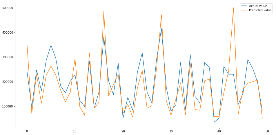
Plotting the predicted versus actual values
To visualise how close, or not, our model gets we can plot the predicted values against the actual values. As you can see from the below plot, the trend is fairly close. There are some places where it performs very well, but there are others where it goes a bit wonky.
test = pd.DataFrame({'Predicted value':y_pred, 'Actual value':y_test})
fig= plt.figure(figsize=(16,8))
test = test.reset_index()
test = test.drop(['index'],axis=1)
plt.plot(test[:50])
plt.legend(['Actual value','Predicted value'])
<matplotlib.legend.Legend at 0x7f527913a190>
That’s the basics of creating a linear regression model in Scikit-Learn. These are the very first steps in creating regression models, but we still got decent results with relatively minimal effort.
Matt Clarke, Saturday, March 06, 2021


Other posts you might like

How to tune a LightGBMClassifier model with Optuna
The LightGBM model is a gradient boosting framework that uses tree-based learning algorithms, much like the popular XGBoost model. LightGBM supports both classification and regression tasks, and is known for...

How to create a customer retention model with XGBoost
Although all business know the importance of retaining customers, few companies are actually able to measure customer retention accurately, and fewer still can predict which ones will churn or be...