How to create a non-contractual churn model for ecommerce
Learn how to create a non-contractual churn model to let you predict churn and identify which customers you are about to lose unless you react.

Knowing which of your customers are going to churn before it happens is a powerful tool in the battle against attrition, since you can take action and try to prevent it. However, measuring customer churn is much harder in non-contractual settings, like ecommerce, than it is in contractual businesses, such as insurance companies or mobile phone networks.
Compared to online retailers, contractual businesses have it easy, because they get to see a customer churning when their contract nears its end. However, in non-contractual businesses attrition is unobserved making it significantly harder to predict.
Contractual churn models can use regular machine learning classification techniques, but non-contractual churn models require a specialist approach due to this unobserved customer attrition.
Unlike contractual churn models, non-contractual churn models need to be able to predict whether a customer is “alive” or “dead” (to use the common Customer Lifetime Value terminology) based on their historic purchasing behaviour, and should not be thrown by temporal patterns, such as holidays or seasonality.
The model most commonly used to tackle the prediction of customer churn in non-contractual settings is the Beta Geometric Negative Binomial Bayes Distribution model or BG/NBD. The maths behind this model are pretty complicated, but are nonetheless a massive simplification over the Pareto/NBD model from which BG/NBD has evolved. Thankfully, you only need to understand the basic principles to apply the BG/NBD model to churn prediction.
Predicting churn with the BG/NBD model
The greatly oversimplified and maths-free explanation of non-contractual churn models is essentially that each customer has a high probability of still being “alive” after just purchasing, but this probability drops with time (which is why RFM favours recency, because it’s the strongest indicator that a customer is still a customer).
Customers shop at different frequencies, so have different interpurchase times or latencies, but will generally re-purchase somewhere around the mean interpurchase time. If a customer goes beyond their mean interpurchase time, the probability of them no longer being a customer increases.
For example, if you normally purchase every 10-15 days, and it’s been 60 days since your last order, there’s a much higher probability that you’ve churned than if you’d purchased 12 days ago. By examining each customer’s tenure, purchase rate, and interpurchase times, non-contractual churn models are therefore able to predict the probability of each customer being “alive” or having churned, so marketers can step in and take action.
Load the packages
The maths behind the BG/NBD model are complicated, but thankfully there’s a superb package called Lifetimes that can handle the application of this for you. It makes the prediction of churn much more straightforward. As well as the lifetimes package, which you can install via Pip, we’ll need Pandas, Seaborn, and Matplotlib for displaying and visualising the data.
import pandas as pd
import seaborn as sns
import matplotlib.pyplot as plt
from matplotlib.pyplot import figure
from lifetimes import BetaGeoFitter
from lifetimes.utils import calibration_and_holdout_data
from lifetimes.utils import summary_data_from_transaction_data
from lifetimes.plotting import plot_frequency_recency_matrix
from lifetimes.plotting import plot_probability_alive_matrix
from lifetimes.plotting import plot_period_transactions
from lifetimes.plotting import plot_history_alive
from lifetimes.plotting import plot_calibration_purchases_vs_holdout_purchases
import warnings

warnings.filterwarnings('ignore')
Load transactional data
To model customer churn in non-contractual settings you only require standard transactional data, including the order ID, the customer ID, the order value, and the date the order was placed. These are easily extracted from most ecommerce platforms. Once you’ve got these, load them up into a Pandas dataframe and ensure the date column is set to datetime format.
df_orders = pd.read_csv('data/transactions.csv')
df_orders['date_created'] = pd.to_datetime(df_orders.date_created)
df_orders.head()
| order_id | customer_id | total_revenue | date_created | |
|---|---|---|---|---|
| 0 | 299527 | 166958 | 74.01 | 2017-04-07 05:54:37 |
| 1 | 299528 | 191708 | 44.62 | 2017-04-07 07:32:54 |
| 2 | 299529 | 199961 | 16.99 | 2017-04-07 08:18:45 |
| 3 | 299530 | 199962 | 11.99 | 2017-04-07 08:20:00 |
| 4 | 299531 | 199963 | 14.49 | 2017-04-07 08:21:34 |
Calculate raw RFM metrics
Churn modeling requires the use of raw non-discretized recency, frequency, and monetary value data on a continuous
scale, rather than assigned to RFM score bins, as you would do via RFM models. The Lifetimes package includes a
helpful function
called summary_data_from_transaction_data() to allow you to quickly calculate these in the specific format required.
df_rfmt = summary_data_from_transaction_data(df_orders,
                                         'customer_id',
                                         'date_created',
                                         'total_revenue',
                                         observation_period_end='2020-10-01')

df_rfmt.head()
| frequency | recency | T | monetary_value | |
|---|---|---|---|---|
| customer_id | ||||
| 0 | 165.0 | 777.0 | 779.0 | 0.000000 |
| 6 | 9.0 | 1138.0 | 1147.0 | 22.045556 |
| 34 | 0.0 | 0.0 | 111.0 | 0.000000 |
| 44 | 12.0 | 1055.0 | 1251.0 | 50.914167 |
| 45 | 0.0 | 0.0 | 538.0 | 0.000000 |
Examine the statistical distribution of the data
Examining the statistical distributions of the recency, frequency, monetary and tenure data shows the usual picture common to ecommerce, where most customers have placed few orders, spent little and shopped fairly infrequently.
ax = sns.distplot(df_rfmt['recency'])

ax = sns.distplot(df_rfmt['frequency'])

ax = sns.distplot(df_rfmt['monetary_value'])

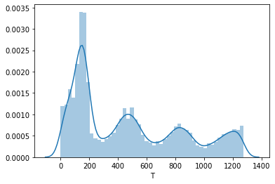
The T plot shows the tenure of the customers. This shows the volumes of customers acquired over time. This retailer has seasonal peaks in customer acquisitions and has been growing these steadily for several years, but it experienced a huge spike in new customer acquisitions in the most recent period.
ax = sns.distplot(df_rfmt['T'])
Fit the model
To create the initial BG/NBD model we can instantiate the BetaGeoFitter() class and fit the model using the frequency, recency, and tenure data. Printing a summary of the model gives a breakdown of the model coefficients.
bgf = BetaGeoFitter(penalizer_coef=0)
bgf.fit(df_rfmt['frequency'], df_rfmt['recency'], df_rfmt['T'])
bgf.summary
| coef | se(coef) | lower 95% bound | upper 95% bound | |
|---|---|---|---|---|
| r | 0.106286 | 0.000921 | 0.104480 | 0.108092 |
| alpha | 30.786602 | 0.569320 | 29.670735 | 31.902468 |
| a | 0.515978 | 0.013150 | 0.490205 | 0.541751 |
| b | 0.856091 | 0.026806 | 0.803550 | 0.908631 |
Plot the churn probability
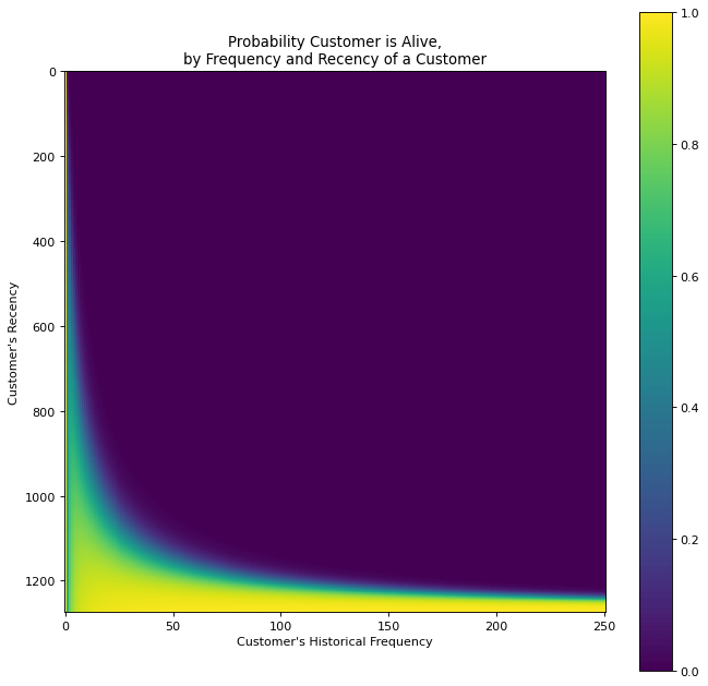
To examine all customers and see how recency and historical frequency impact the probability of customers being alive or having churned, we can plot the data on a heatmap matrix using the plot_probability_alive_matrix() function.
figure(num=None, figsize=(10, 10), dpi=80, facecolor='w', edgecolor='k')

plot_probability_alive_matrix(bgf)
<matplotlib.axes._subplots.AxesSubplot at 0x7f10b1fef820>
Predict future order volumes
As the model examines the historical purchasing behaviour of each customer, as well as their probability of being alive, we’re also able to predict how many orders each customer will make in the next period (set to 90 days in my below example).
t = 90
df_rfmt['predicted_purchases'] = bgf.conditional_expected_number_of_purchases_up_to_time(t,
                                                                                      df_rfmt['frequency'],
                                                                                      df_rfmt['recency'],
                                                                                      df_rfmt['T'])
df_rfmt.sort_values(by='predicted_purchases').tail(10)
| frequency | recency | T | monetary_value | predicted_purchases | |
|---|---|---|---|---|---|
| customer_id | |||||
| 419431 | 13.0 | 131.0 | 131.0 | 100.810769 | 6.226748 |
| 379598 | 19.0 | 204.0 | 204.0 | 184.559474 | 6.541054 |
| 436281 | 12.0 | 82.0 | 91.0 | 28.352500 | 6.936018 |
| 371248 | 33.0 | 273.0 | 276.0 | 528.616364 | 8.880676 |
| 5349 | 170.0 | 1266.0 | 1267.0 | 264.371706 | 11.552999 |
| 370212 | 56.0 | 287.0 | 290.0 | 280.891429 | 14.516430 |
| 0 | 165.0 | 777.0 | 779.0 | 0.000000 | 17.768561 |
| 350047 | 115.0 | 394.0 | 397.0 | 652.167130 | 22.798098 |
| 350046 | 125.0 | 394.0 | 397.0 | 300.740800 | 24.781726 |
| 311109 | 250.0 | 530.0 | 533.0 | 3948.793840 | 38.104691 |
Assess the model’s performance
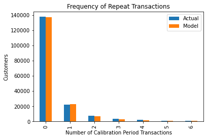
To get a basic view of how accurately the model can predict the frequency of repeat transactions we can plot the actual data against the model’s predictions using the plot_period_transactions() function. As you can see, it’s extremely effective!
plot_period_transactions(bgf)
<matplotlib.axes._subplots.AxesSubplot at 0x7f10b226a1f0>
Add a holdout group
To make the model a bit more robust, it’s a good idea to add in an additional holdout group. This trains the model on a calibration (or training) period and then makes predictions for the observation (or test) period, using data that was held out that the model has never seen. The idea is essentially like “backcasting”, where predictions are made against a period for which you know the results, before putting the model into production.
summary_cal_holdout = calibration_and_holdout_data(df_orders,
                                                   'customer_id',
                                                   'date_created',
                                                    calibration_period_end='2020-06-01',
                                                    observation_period_end='2020-10-01')
summary_cal_holdout.sort_values(by='frequency_holdout', ascending=False).head()
| frequency_cal | recency_cal | T_cal | frequency_holdout | duration_holdout | |
|---|---|---|---|---|---|
| customer_id | |||||
| 0 | 108.0 | 654.0 | 657.0 | 57.0 | 122.0 |
| 5349 | 150.0 | 1134.0 | 1145.0 | 20.0 | 122.0 |
| 311109 | 232.0 | 404.0 | 411.0 | 18.0 | 122.0 |
| 370212 | 38.0 | 161.0 | 168.0 | 18.0 | 122.0 |
| 350047 | 97.0 | 268.0 | 275.0 | 18.0 | 122.0 |
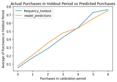
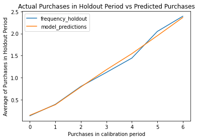
Re-fit the model
By re-fitting the model on the new training (or calibration) data, we can then plot the frequency of purchases the model predicted in the holdout period versus the actual data. As you can see, the model is very close.
bgf.fit(summary_cal_holdout['frequency_cal'],
        summary_cal_holdout['recency_cal'],
        summary_cal_holdout['T_cal'])
<lifetimes.BetaGeoFitter: fitted with 145727 subjects, a: 0.48, alpha: 33.72, b: 0.83, r: 0.11>
plot_calibration_purchases_vs_holdout_purchases(bgf, summary_cal_holdout)
<matplotlib.axes._subplots.AxesSubplot at 0x7f10b218f310>
Extend the holdout period
As you might imagine, the duration of the holdout period makes a difference to the performance of the model. Shorter periods are much harder to get right, due to natural changes in customer behaviour, so setting a longer period will likely give you greater accuracy. Of course, the period you set depends on your business.
from lifetimes.utils import calibration_and_holdout_data
from lifetimes.plotting import plot_calibration_purchases_vs_holdout_purchases

summary_cal_holdout = calibration_and_holdout_data(df_orders,
                                                   'customer_id',
                                                   'date_created',
                                                    calibration_period_end='2019-10-01',
                                                    observation_period_end='2020-10-01')

bgf.fit(summary_cal_holdout['frequency_cal'],
        summary_cal_holdout['recency_cal'],
        summary_cal_holdout['T_cal'])
<lifetimes.BetaGeoFitter: fitted with 91360 subjects, a: 0.49, alpha: 37.84, b: 0.83, r: 0.12>
plot_calibration_purchases_vs_holdout_purchases(bgf, summary_cal_holdout)
<matplotlib.axes._subplots.AxesSubplot at 0x7f10b20269d0>
Generate customer-level predictions
The model can now be used to generate predictions for any customer in your dataset, simply by providing the index number relating to that customer. For example, we can see that the first customer in the dataset is predicted to place 2.47 orders over the coming year.
t = 365
individual = df_rfmt.iloc[1]
bgf.predict(t,
            individual['frequency'],
            individual['recency'],
            individual['T'])
2.4773388861279257
Plot historical churn probability
The other fascinating thing you can examine is the individual churn probability of a customer. This is very powerful in B2B ecommerce settings where customers have account managers who monitor customers and try to prevent them from churning. The data below show a random customer’s historical behaviour.
example_customer_orders = df_orders.loc[df_orders['customer_id'] == 436281]
example_customer_orders
| order_id | customer_id | total_revenue | date_created | |
|---|---|---|---|---|
| 240206 | 554824 | 436281 | 16.94 | 2020-07-02 22:03:40 |
| 242731 | 557349 | 436281 | 43.82 | 2020-07-09 14:30:59 |
| 243396 | 558014 | 436281 | 26.10 | 2020-07-11 14:13:06 |
| 246420 | 561038 | 436281 | 25.05 | 2020-07-19 13:12:53 |
| 248893 | 563511 | 436281 | 20.57 | 2020-07-23 18:41:39 |
| 248992 | 563610 | 436281 | 40.25 | 2020-07-24 01:16:16 |
| 255057 | 569675 | 436281 | 12.62 | 2020-08-06 15:46:45 |
| 259436 | 574054 | 436281 | 29.84 | 2020-08-16 10:40:33 |
| 262144 | 576762 | 436281 | 16.85 | 2020-08-22 12:55:15 |
| 262658 | 577276 | 436281 | 42.83 | 2020-08-23 22:09:23 |
| 265330 | 579948 | 436281 | 49.02 | 2020-08-30 11:30:59 |
| 270570 | 585188 | 436281 | 16.45 | 2020-09-12 18:53:28 |
| 274453 | 589071 | 436281 | 16.83 | 2020-09-22 07:37:58 |
| 280699 | 595317 | 436281 | 43.52 | 2020-10-11 16:14:29 |
| 283196 | 597814 | 436281 | 0.00 | 2020-10-19 16:15:39 |
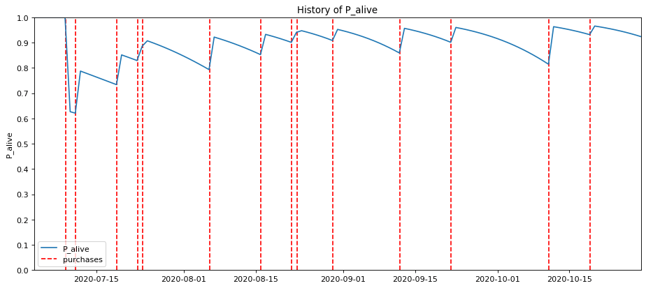
My absolute favourite plot, however, is provided by the plot_history_alive() function. Each red line corresponds to an order placed by a customer, with the blue line representing their probability of being alive or having churned. As you can see, this customer generally orders fairly regularly, but has some longer seasonal gaps.
These gaps might coincide with a seasonal drop in demand for the products they purchase, or perhaps the customer just went on holiday at that time. In those periods, you can clearly see the probability of them being alive dropping off.
figure(num=None, figsize=(14, 6), dpi=80, facecolor='w', edgecolor='k')

days_since_birth = 118
plot_history_alive(bgf, days_since_birth, example_customer_orders, 'date_created')
<matplotlib.axes._subplots.AxesSubplot at 0x7f10b2197250>
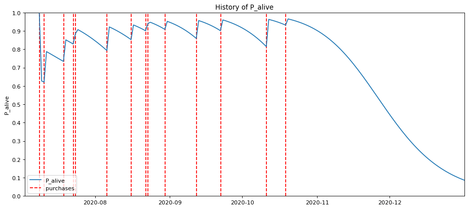
Looking into the future for this customer, you can see their probability of being alive massively dropping off. If they’ve not ordered by mid-November, the probability of them churning goes up massively.
figure(num=None, figsize=(14, 6), dpi=80, facecolor='w', edgecolor='k')

days_since_birth = 182
plot_history_alive(bgf, days_since_birth, example_customer_orders, 'date_created')
<matplotlib.axes._subplots.AxesSubplot at 0x7f10b20a1c10>
I won’t cover the marketing strategies you can use for retaining customers you’ve identified as likely to churn, but would recommend that you look at the potential reasons for churn to see if you can identify the cause.
The Cox Proportional Hazards model is great for this purpose and can show you which customer experiences (such as damages, returns, delays, or poorly handled complaints) may be contributed to customer attrition.
Further reading
-
Fader, P.S., Hardie, B.G. and Lee, K.L., 2005. “Counting your customers” the easy way: An alternative to the Pareto/NBD model. Marketing science, 24(2), pp.275-284.
-
Fader, P.S. and Hardie, B.G., 2013. The Gamma-Gamma model of monetary value.
-
Schmittlein, D.C., Morrison, D.G. and Colombo, R., 1987. Counting your customers: Who-are they and what will they do next?. Management science, 33(1), pp.1-24.
Matt Clarke, Sunday, March 14, 2021


Other posts you might like

How to tune a LightGBMClassifier model with Optuna
The LightGBM model is a gradient boosting framework that uses tree-based learning algorithms, much like the popular XGBoost model. LightGBM supports both classification and regression tasks, and is known for...

How to create a customer retention model with XGBoost
Although all business know the importance of retaining customers, few companies are actually able to measure customer retention accurately, and fewer still can predict which ones will churn or be...