How to identify the causes of customer churn
Discover how to identify the causes of customer churn using Cox's Proportional Hazards model, so you can improve your customer retention rate.

Understanding what drives customer churn is critical to business success. While there is always going to be natural churn that you can’t prevent, the most common reasons for churn are invariably linked to your operational service quality, and how your customer service team handles problems when they arise.
If you can identify the specific causes of churn, you can try to improve in those areas, and your customer retention rate should go up. One way to achieve this is through survival analysis, which looks at the factors associated with the loss of customers over time.
In this project, we’ll use Cox’s Proportional Hazards model to examine a contractual churn dataset to quickly identify the factors associated with the loss of customers. This only scratches the surface of what you can do, but it’s often all that’s needed to find what needs fixing. Here’s how it’s done.
Building a churn model dataset
I’m using a contractual churn dataset for this project. These are easier to work with than non-contractual churn datasets, because the time of a customer’s “death” (in CLV terms, not literally) is measurable. If you’re in a non-contractual business, such as online retail, you will need to model the time of death using a model such as BG/NBD.
Each row in your dataset needs to represent a customer. You’ll require a column containing your target variable (i.e. churn) and a time-based metric, such as tenure based on the number of days between “birth” and “death”, plus a wide range of features. Certain features are commonly associated with churn, so try to extract these if you can.
| Service quality | Customers who experience operational service quality issues, such as damages, delays, incorrect or incomplete orders, and even returns or service that was just "meh", are commonly associated with churn. Capturing data on these factors can show you how they're linked. |
| Service contact | Customers generally only make contact with your customer service team when something goes wrong (usually for one of the reasons above) so it makes sense that the number of service contacts, and their type, are associated with churn. In settings where customers interact online, they generally expect to have issues resolved online, so making them ring a call centre is often a turn off. Measure how they made contact and how many times it happened. |
| Customer service quality | Next there's the quality of customer service they received when they made contact. Online retailers often love to knock Amazon, but they're actually bloody brilliant when it comes to this. Staff are polite, they actually apologise for the issue (even when not their fault), they give refunds almost instantaneously, and rarely quibble. If customers complain about your policies, you definitely need to record it, as it's usually highly correlated with churn. I've yet to run a service recovery test where it hasn't made a massive contribution towards reversing the trend, so record this too. |
| Pricing | Finally, there are price-related issues. These often go unnoticed because the people who set prices are generally thinking about margin and not customer retention, but putting up product or delivery prices can mean customers don't come back. They are, however, much harder to capture, especially when multiple products are purchased. |
 Customers who call are more likely to churn. Picture by Pixabay, Pexels.
Load the packages
Open a new Python script or Jupyter notebook and import the pandas, numpy, lifelines, and matplotlib packages. Any packages you don’t have can be installed by entering pip3 install package-name in your terminal. Lifelines will be doing the bulk of the work here.
import pandas as pd
import numpy as np
from lifelines import CoxPHFitter
import matplotlib.pyplot as plt
Load the data
You can use your own dataset for this if you like. I’m using a churn dataset from a telecoms provider. This comprises one row per customer and includes a boolean churn metric, and a range of features that we can examine to see what influences churn and retention the most.
df = pd.read_csv('train.csv')
df.head().T
| 0 | 1 | 2 | 3 | 4 | |
|---|---|---|---|---|---|
| state | OH | NJ | OH | OK | MA |
| account_length | 107 | 137 | 84 | 75 | 121 |
| area_code | area_code_415 | area_code_415 | area_code_408 | area_code_415 | area_code_510 |
| international_plan | no | no | yes | yes | no |
| voice_mail_plan | yes | no | no | no | yes |
| number_vmail_messages | 26 | 0 | 0 | 0 | 24 |
| total_day_minutes | 161.6 | 243.4 | 299.4 | 166.7 | 218.2 |
| total_day_calls | 123 | 114 | 71 | 113 | 88 |
| total_day_charge | 27.47 | 41.38 | 50.9 | 28.34 | 37.09 |
| total_eve_minutes | 195.5 | 121.2 | 61.9 | 148.3 | 348.5 |
| total_eve_calls | 103 | 110 | 88 | 122 | 108 |
| total_eve_charge | 16.62 | 10.3 | 5.26 | 12.61 | 29.62 |
| total_night_minutes | 254.4 | 162.6 | 196.9 | 186.9 | 212.6 |
| total_night_calls | 103 | 104 | 89 | 121 | 118 |
| total_night_charge | 11.45 | 7.32 | 8.86 | 8.41 | 9.57 |
| total_intl_minutes | 13.7 | 12.2 | 6.6 | 10.1 | 7.5 |
| total_intl_calls | 3 | 5 | 7 | 3 | 7 |
| total_intl_charge | 3.7 | 3.29 | 1.78 | 2.73 | 2.03 |
| number_customer_service_calls | 1 | 0 | 2 | 3 | 3 |
| churn | no | no | no | no | no |
Prepare the data
To prepare the data for use by the model we need to binarise the boolean values stored in the churn, international_plan, and voice_mail_plan columns. Rather than one-hot encoding them, which would introduce multi-collinearity (since yes is the opposite of no). I’ve used np.where() to replace the yes with a 1.
df['churn'] = np.where(df['churn'].str.contains('yes'), 1, 0)
df['international_plan'] = np.where(df['international_plan'].str.contains('yes'), 1, 0)
df['voice_mail_plan'] = np.where(df['voice_mail_plan'].str.contains('yes'), 1, 0)
To simplify the output, I have dropped the state column, but there is actually useful data in here. It simply makes the dataframes and plots too big to see easily. Finally, I’ve used get_dummies() to one-hot encode the area code field, which is quite low cardinality.
df = df.drop(columns=['state'])
df = pd.get_dummies(df)
df.head().T
| 0 | 1 | 2 | 3 | 4 | |
|---|---|---|---|---|---|
| account_length | 107.00 | 137.00 | 84.00 | 75.00 | 121.00 |
| international_plan | 0.00 | 0.00 | 1.00 | 1.00 | 0.00 |
| voice_mail_plan | 1.00 | 0.00 | 0.00 | 0.00 | 1.00 |
| number_vmail_messages | 26.00 | 0.00 | 0.00 | 0.00 | 24.00 |
| total_day_minutes | 161.60 | 243.40 | 299.40 | 166.70 | 218.20 |
| total_day_calls | 123.00 | 114.00 | 71.00 | 113.00 | 88.00 |
| total_day_charge | 27.47 | 41.38 | 50.90 | 28.34 | 37.09 |
| total_eve_minutes | 195.50 | 121.20 | 61.90 | 148.30 | 348.50 |
| total_eve_calls | 103.00 | 110.00 | 88.00 | 122.00 | 108.00 |
| total_eve_charge | 16.62 | 10.30 | 5.26 | 12.61 | 29.62 |
| total_night_minutes | 254.40 | 162.60 | 196.90 | 186.90 | 212.60 |
| total_night_calls | 103.00 | 104.00 | 89.00 | 121.00 | 118.00 |
| total_night_charge | 11.45 | 7.32 | 8.86 | 8.41 | 9.57 |
| total_intl_minutes | 13.70 | 12.20 | 6.60 | 10.10 | 7.50 |
| total_intl_calls | 3.00 | 5.00 | 7.00 | 3.00 | 7.00 |
| total_intl_charge | 3.70 | 3.29 | 1.78 | 2.73 | 2.03 |
| number_customer_service_calls | 1.00 | 0.00 | 2.00 | 3.00 | 3.00 |
| churn | 0.00 | 0.00 | 0.00 | 0.00 | 0.00 |
| area_code_area_code_408 | 0.00 | 0.00 | 1.00 | 0.00 | 0.00 |
| area_code_area_code_415 | 1.00 | 1.00 | 0.00 | 1.00 | 0.00 |
| area_code_area_code_510 | 0.00 | 0.00 | 0.00 | 0.00 | 1.00 |
Fit Cox’s Proportional Hazards model
Next we can fit Cox’s Proportional Hazards model to our data using the CoxPHFitter(). When you fit the model, you’ll need to pass in your dataframe, the duration column (i.e. account_length, and the event column (i.e. churn).
If you run into issues with model convergence, you may need to pass in a penalizer value as a workaround. The Lifelines documentation provides guidance on resolving this.
cph = CoxPHFitter(penalizer=0.1)
cph.fit(df,
        'account_length',
        event_col='churn')
<lifelines.CoxPHFitter: fitted with 4250 total observations, 3652 right-censored observations>
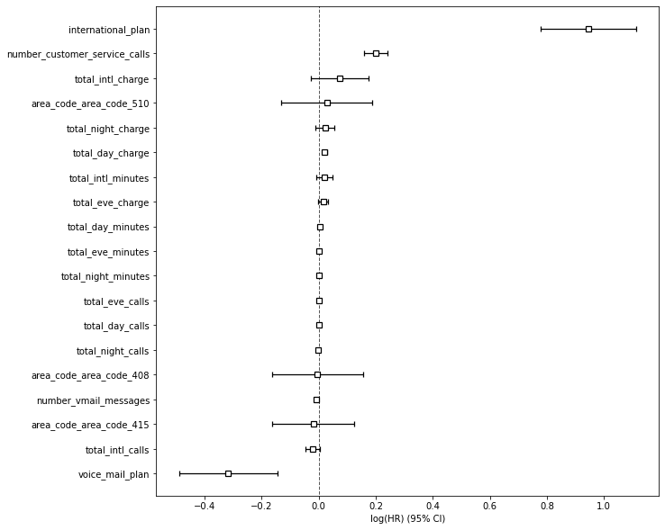
If you use print_summary() on your CoxPHFitter model object you’ll get a detailed breakdown of the model configuration used and the coefficients identied. As you can see by the high value for international_plan, this has a 0.95 coefficient and is highly correlated with attrition. It’s easier to examine these factors in a plot, so we’ll tackle that next.
cph.print_summary()
| model | lifelines.CoxPHFitter |
|---|---|
| duration col | 'account_length' |
| event col | 'churn' |
| penalizer | 0.1 |
| l1 ratio | 0 |
| baseline estimation | breslow |
| number of observations | 4250 |
| number of events observed | 598 |
| partial log-likelihood | -4183.60 |
| time fit was run | 2021-01-19 16:56:16 UTC |
| coef | exp(coef) | se(coef) | coef lower 95% | coef upper 95% | exp(coef) lower 95% | exp(coef) upper 95% | z | p | -log2(p) | |
|---|---|---|---|---|---|---|---|---|---|---|
| international_plan | 0.95 | 2.58 | 0.09 | 0.78 | 1.11 | 2.18 | 3.04 | 11.13 | <0.005 | 93.12 |
| voice_mail_plan | -0.32 | 0.73 | 0.09 | -0.49 | -0.14 | 0.61 | 0.87 | -3.59 | <0.005 | 11.56 |
| number_vmail_messages | -0.01 | 0.99 | 0.00 | -0.01 | -0.00 | 0.99 | 1.00 | -2.31 | 0.02 | 5.57 |
| total_day_minutes | 0.00 | 1.00 | 0.00 | 0.00 | 0.00 | 1.00 | 1.00 | 4.96 | <0.005 | 20.46 |
| total_day_calls | 0.00 | 1.00 | 0.00 | -0.00 | 0.00 | 1.00 | 1.00 | 0.13 | 0.90 | 0.15 |
| total_day_charge | 0.02 | 1.02 | 0.00 | 0.01 | 0.03 | 1.01 | 1.03 | 4.96 | <0.005 | 20.46 |
| total_eve_minutes | 0.00 | 1.00 | 0.00 | -0.00 | 0.00 | 1.00 | 1.00 | 1.83 | 0.07 | 3.90 |
| total_eve_calls | 0.00 | 1.00 | 0.00 | -0.00 | 0.00 | 1.00 | 1.00 | 0.14 | 0.89 | 0.17 |
| total_eve_charge | 0.02 | 1.02 | 0.01 | -0.00 | 0.03 | 1.00 | 1.03 | 1.83 | 0.07 | 3.90 |
| total_night_minutes | 0.00 | 1.00 | 0.00 | -0.00 | 0.00 | 1.00 | 1.00 | 1.32 | 0.19 | 2.41 |
| total_night_calls | -0.00 | 1.00 | 0.00 | -0.00 | 0.00 | 1.00 | 1.00 | -0.38 | 0.70 | 0.51 |
| total_night_charge | 0.02 | 1.02 | 0.02 | -0.01 | 0.06 | 0.99 | 1.06 | 1.32 | 0.19 | 2.41 |
| total_intl_minutes | 0.02 | 1.02 | 0.01 | -0.01 | 0.05 | 0.99 | 1.05 | 1.44 | 0.15 | 2.74 |
| total_intl_calls | -0.02 | 0.98 | 0.01 | -0.05 | 0.00 | 0.95 | 1.00 | -1.64 | 0.10 | 3.31 |
| total_intl_charge | 0.07 | 1.08 | 0.05 | -0.03 | 0.18 | 0.97 | 1.19 | 1.44 | 0.15 | 2.75 |
| number_customer_service_calls | 0.20 | 1.22 | 0.02 | 0.16 | 0.24 | 1.17 | 1.27 | 9.70 | <0.005 | 71.51 |
| area_code_area_code_408 | -0.00 | 1.00 | 0.08 | -0.16 | 0.16 | 0.85 | 1.17 | -0.05 | 0.96 | 0.05 |
| area_code_area_code_415 | -0.02 | 0.98 | 0.07 | -0.16 | 0.13 | 0.85 | 1.13 | -0.25 | 0.80 | 0.32 |
| area_code_area_code_510 | 0.03 | 1.03 | 0.08 | -0.13 | 0.19 | 0.88 | 1.21 | 0.35 | 0.72 | 0.47 |
| Concordance | 0.78 |
|---|---|
| Partial AIC | 8405.19 |
| log-likelihood ratio test | 395.89 on 19 df |
| -log2(p) of ll-ratio test | 237.53 |
Plot the model coefficients
By appending the plot() function to our cph object containing the fitted model we can visualise the coefficients.
plt.figure(figsize=(10,10))
cox = cph.plot()
The key issues
This is only a very basic example of what you can do (partly limited by the lack of time series data in this dataset), but it also shows you how easy it is to spot what’s going wrong, so you can investigate and fix the issues. Here’s what we found and what action needs to be taken.
| International calls | Customers on the international plan are significantly more likely to churn. Obviously, there's also a link with the total international charges metric, so perhaps they're leaving because the prices are too high. |
| Customer service calls | The next big issue is with the number of customer of service calls placed. This is generally one of the top reasons for churn anywhere, so it's vital you try to identify what went wrong and caused these customers to call. Could customers have resolved their issue online? Were they on hold for ages? Did it take several calls to get an adequate resolution? Did staff actually apologise for the problem? Was service recovery used to try and turn things around? |
| Voice mail plan | Customers on the voice mail plan are least likely to churn, so there might be something the company can do here. Perhaps aiming to acquire voice mail customers, encouraging others to move to this plan, or examining why the customers here are less likely to churn than the rest would help. |
Matt Clarke, Sunday, March 14, 2021


Other posts you might like

How to tune a LightGBMClassifier model with Optuna
The LightGBM model is a gradient boosting framework that uses tree-based learning algorithms, much like the popular XGBoost model. LightGBM supports both classification and regression tasks, and is known for...

How to create a customer retention model with XGBoost
Although all business know the importance of retaining customers, few companies are actually able to measure customer retention accurately, and fewer still can predict which ones will churn or be...