How to use k means clustering for customer segmentation
K means clustering is the most widely used machine learning algorithm and is well-suited to customer segmentation models. Here’s how you can use it.

K means is one of the most widely used algorithms for clustering data and falls into the unsupervised learning group of machine learning models. It’s ideal for many forms of customer segmentation. Unlike supervised learning models, unsupervised learning models work by identifying previously undetected patterns in data without the benefit of a label to teach the model what to do.
For example, in a supervised learning model, such as a decision tree, you provide labelled training data telling the model the class of the target variable (i.e. spam or not spam, terrorist or non-terrorist, fraud or non-fraud). The supervised learning model finds the mathematical relationships between the features and the target variable using the labelled training data, allowing it to make predictions on unseen data based on similarities with the training data.
Unsupervised learning models are simply given a set of data and told to put the data into groups based on the similarities of the data within. For a clustering algorithm on a customer data set, this might be the placement of customers into clusters based on their recency, frequency, or monetary value, the products they purchase, or a combination of many features.
The model creates clearly define customer segments based on a number of different features and is used to assign a cluster label to each group. For example, you might call these gold, silver, and bronze if they’re based on customer values. The segments can then be used to modify the way in which the customers receive marketing or customer service levels based on the segment to which they’ve been assigned.
How does k means clustering work?
To understand how k means clustering works, the first thing you need to understand is what “k” relates to. In k means clustering “k” is simply the number of clusters or groups created. With k means clustering you define how many clusters the model should create, and the algorithm creates them.
The “means” bit of k means refers to the underlying process by which each observation (or related set of data, such as a customer) is associated to the cluster. If you create a k means model and define that you want to have five clusters, the algorithm will initially create five random points called “centroids”.
Mathematically, the algorithm aims to minimise the within-cluster sum of square distances from the mean or SSE. The algorithm therefore assigns each observation to the nearest cluster, then updates the centroid by calculating the mean of each observation in the cluster until it is unable to gain further improvement.
Assumptions in k means clustering
The k means algorithm makes several assumptions about the data that are important to understand. While it often still “works” if you ignore them, you’ll see far better results if you transform the data to work within its assumptions.
- Equal variance: K-means assumes that variables have the same variance. The mean and standard deviation of the values should be similar. If they’re not, you’ll need to scale and standardise the variables.
- Normal distribution: K-means expects the distribution of each variable to be normal, not highly skewed. If it’s skewed, you’ll need to transform it first using a log transform, Box Cox, or similar.
- Similarly sized spherical clusters: It also expects data to form spherical clusters of roughly similar size. If your data aren’t distributed in this way, you may need a different algorithm.
Load the packages
For this project we’ll be using Pandas, Numpy, Datetime, Seaborn and Matplotlib for loading, manipulating and visualising our data. We can use the KMeans model from scikit-learn, along with the StandardScaler for data preprocessing and the kneed package for centroid detection. To make the plots a bit sharper on larger screens we’ll set the default size to 15” by 6”.
import pandas as pd
import numpy as np
import datetime as dt
import seaborn as sns
import matplotlib.pyplot as plt
from sklearn.preprocessing import StandardScaler
from sklearn.cluster import KMeans
from kneed import KneeLocator
sns.set(rc={'figure.figsize':(15, 6)})
Load the data
You can, of course, use any data you like. I’ve chosen the Online Retail II dataset from the UCI Machine Learning Repository, as this represents the kind of transactional item dataset commonly encountered in ecommerce. We only need a few columns to create our segmentation model, so I’ve using the Pandas read_excel() function to load the data with the optional usecols argument.
To tidy up the data I have renamed the Pandas columns, calculated the line_price for each SKU, and then filtered the dataframe to remove any zero-value orders. The tail() shows us the last five lines from the dataset, showing one SKU per line. I’ve then used df.describe() to summarise the key statistics on the data.
df = pd.read_excel('https://archive.ics.uci.edu/ml/machine-learning-databases/00502/online_retail_II.xlsx',
                  usecols=['Invoice','Quantity','InvoiceDate','Price','Customer ID'])
df = df.rename(columns={'Invoice':'order_id','Quantity':'quantity','InvoiceDate':'order_date',
                       'Price':'unit_price','Customer ID':'customer_id'})
df['line_price'] = df['unit_price'] * df['quantity']
df = df[df['line_price'] > 0]
df.tail()
| order_id | quantity | order_date | unit_price | customer_id | line_price | |
|---|---|---|---|---|---|---|
| 525456 | 538171 | 2 | 2010-12-09 20:01:00 | 2.95 | 17530.0 | 5.90 |
| 525457 | 538171 | 1 | 2010-12-09 20:01:00 | 3.75 | 17530.0 | 3.75 |
| 525458 | 538171 | 1 | 2010-12-09 20:01:00 | 3.75 | 17530.0 | 3.75 |
| 525459 | 538171 | 2 | 2010-12-09 20:01:00 | 3.75 | 17530.0 | 7.50 |
| 525460 | 538171 | 2 | 2010-12-09 20:01:00 | 1.95 | 17530.0 | 3.90 |
df.describe()
| quantity | unit_price | customer_id | line_price | |
|---|---|---|---|---|
| count | 511566.000000 | 511566.000000 | 407664.000000 | 511566.000000 |
| mean | 11.400150 | 4.252563 | 15368.592598 | 20.146502 |
| std | 86.761177 | 63.664629 | 1679.762138 | 90.920077 |
| min | 1.000000 | 0.001000 | 12346.000000 | 0.001000 |
| 25% | 1.000000 | 1.250000 | 13997.000000 | 4.200000 |
| 50% | 3.000000 | 2.100000 | 15321.000000 | 10.140000 |
| 75% | 10.000000 | 4.210000 | 16812.000000 | 17.700000 |
| max | 19152.000000 | 25111.090000 | 18287.000000 | 25111.090000 |
Engineer the features
To create the data we need for clustering we’ll calculate some RFM variables. These examine the recency, frequency, and monetary value of each customer. In ecommerce, RFM can tell you a huge amount and is central to nearly every type of model used.
Customers who are more recent, more frequent, and have spent more are more likely to purchase again, so the RFM model data can tell us which customers are most active, which are most valuable, and which are most likely to be lapsed, or are about to lapse.
There are many ways to calculate the raw RFM variables. To keep things simple, I’ve looked at the whole dataset (rather than the last 12 months) and have calculated recency as the number of days since the last order, frequency as the count of total orders, and monetary as the sum value of all orders.
end_date = max(df['order_date']) + dt.timedelta(days=1)

df_rfm = df.groupby('customer_id').agg(
    recency=('order_date', lambda x: (end_date - x.max()).days),
    frequency=('order_id', 'count'),
    monetary=('line_price', 'sum')
).reset_index()

df_rfm.head()
| customer_id | recency | frequency | monetary | |
|---|---|---|---|---|
| 0 | 12346.0 | 165 | 33 | 372.86 |
| 1 | 12347.0 | 3 | 71 | 1323.32 |
| 2 | 12348.0 | 74 | 20 | 222.16 |
| 3 | 12349.0 | 43 | 102 | 2671.14 |
| 4 | 12351.0 | 11 | 21 | 300.93 |
Examine the data
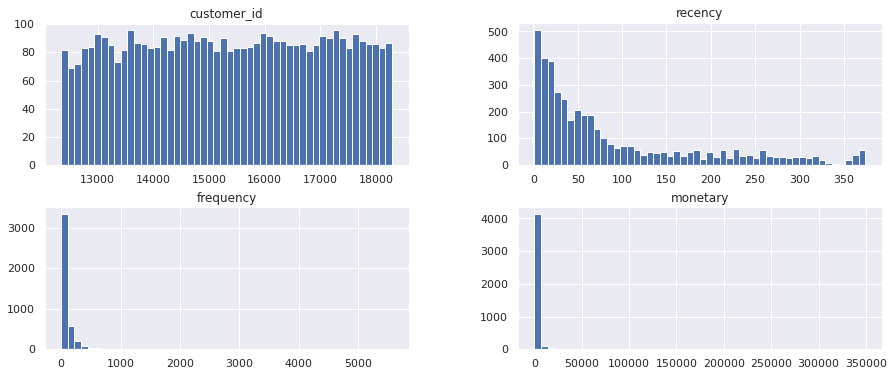
If you use the Pandas describe() function to examine the summary statistics for our newly created df_rfm dataframe you’ll see that we have a couple of issues to resolve first. K means expects our data to have equal variance, but the mean and std for each metric indicate that this isn’t the case. This is perfectly normal for RFM data, but it shows that we need to preprocess the data first to resolve this.
df_rfm.describe()
| customer_id | recency | frequency | monetary | |
|---|---|---|---|---|
| count | 4312.000000 | 4312.000000 | 4312.000000 | 4312.000000 |
| mean | 15349.290353 | 91.171846 | 94.541744 | 2048.238236 |
| std | 1701.200176 | 96.860633 | 202.046410 | 8914.481280 |
| min | 12346.000000 | 1.000000 | 1.000000 | 2.950000 |
| 25% | 13882.500000 | 18.000000 | 18.000000 | 307.987500 |
| 50% | 15350.500000 | 53.000000 | 44.000000 | 706.020000 |
| 75% | 16834.250000 | 136.000000 | 102.000000 | 1723.142500 |
| max | 18287.000000 | 374.000000 | 5570.000000 | 349164.350000 |
Similarly, if you examine the statistical distributions of the data using a set of Pandas histograms, you’ll see that the data are strongly skewed. Again, this is perfectly normal in retail, but it shows us that we need to transform the data to make the distribution a bit more “normal”, in statistical terms.
hist = df_rfm.hist(bins=50)
Preprocess the data
To handle the unequal variance in the mean and standard deviation and shift the statistical distribution a bit closer to a normal distribution we need to do a bit of preprocessing before we feed the data to our k means clustering model.
To make the distribution more normal we can use a log transformation. I’ve used a log1p() transform from Numpy for this. Next, we can use the StandardScaler from scikit-learn to handle the unequal variance.
After instantiating the StandardScaler we fit it to the log transformed dataframe, then use this transform() function to return a Numpy array containing scaled data in which the mean and standard deviation are all more similar than before. This will also speed things up a bit.
def preprocess(df):
    """Preprocess data for KMeans clustering"""

    df_log = np.log1p(df)
    scaler = StandardScaler()
    scaler.fit(df_log)
    norm = scaler.transform(df_log)

    return norm
norm = preprocess(df_rfm)
Identifying the optimum number of clusters
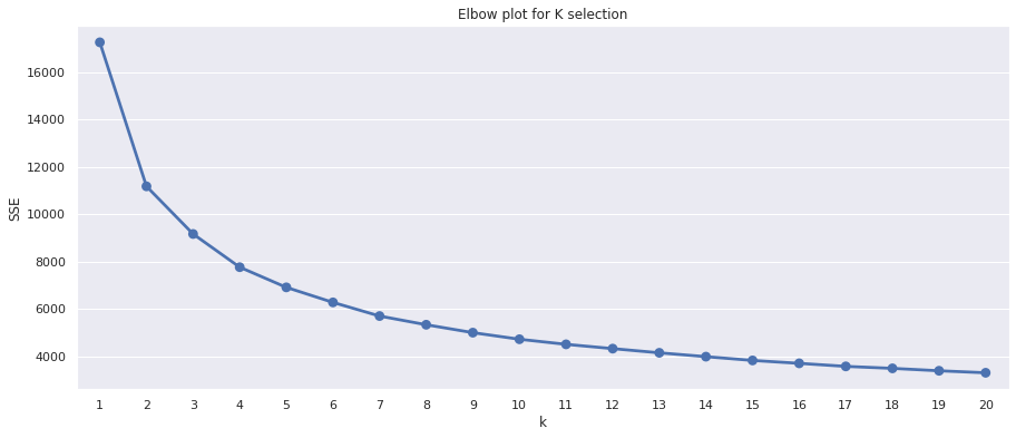
As I mentioned above, the k means algorithm requires that you define k, or the number of clusters when you run it. Rather than just picking a random value, or picking one that seems to make sense from a business perspective, there’s actually a range of special technique that you can use to select the optimum k. The elbow method is probably the most common.
The elbow method is a data visualisation technique for selecting the right number of k means centroids to use when creating your model. It works by looking for the inflection point, or elbow, in a plot of the sum of squared error (SSE) for each number of clusters. The inflection point, where the bend in the knee or elbow occurs, tells you the optimum k to use, since adding more clusters stops improving performance.
To create an elbow plot we’ll define a function we can re-use. This normalises the data using our preprocess() function, then creates a dictionary called sse into which we’ll store the SSE for each model. We then fit 20 k means models using a different k each time, recording the k in the sse dictionary as we go. At the end, we create a Seaborn pointplot() to show the elbow plot for each number of clusters.
def elbow_plot(df):
    """Create elbow plot from normalized data"""

    norm = preprocess(df)

    sse = {}

    for k in range(1, 21):
        kmeans = KMeans(n_clusters=k, random_state=1)
        kmeans.fit(norm)
        sse[k] = kmeans.inertia_

    plt.title('Elbow plot for K selection')
    plt.xlabel('k')
    plt.ylabel('SSE')
    sns.pointplot(x=list(sse.keys()),
                 y=list(sse.values()))
    plt.show()
The minor downside of the elbow plot is that on some datasets it can be tricky to spot the exact inflection point representing the knee or elbow. On the plot below, it appears to lie between 4 and 6, so we could try each k and see which one works best for our business needs.
elbow_plot(df_rfm)
The other approach, which resolves the difficulties in manually identifying the inflection point on the elbow plot, is to use a computational approach to finding the optimum k. One of the easiest you can use is the Kneedle algorithm, which is implemented in Python in a package called kneed.
The approach to this is much like the elbow method. We normalize the data, then fit the k means model with a different k each time and store the values in sse. Then, we use the KneeLocator() method from the kneed package to identify the inflection point mathematically. Additionally, I’ve tweaked the function below to allow me to increment or decrement k to try values on either side.
def find_k(df, increment=0, decrement=0):
    """Find the optimum k clusters"""

    norm = preprocess(df)
    sse = {}

    for k in range(1, 21):
        kmeans = KMeans(n_clusters=k, random_state=1)
        kmeans.fit(norm)
        sse[k] = kmeans.inertia_

    kn = KneeLocator(
                 x=list(sse.keys()),
                 y=list(sse.values()),
                 curve='convex',
                 direction='decreasing'
                 )
    k = kn.knee + increment - decrement
    return k
Running the find_k() function on our df_rfm dataframe returns a value of 5, which is what we should use as our k value to get the optimum results, according to the Kneedle algorithm. You don’t have to use this. A value either side might be more practical for business purposes, but it’s usually spot on.
k = find_k(df_rfm)
k
5
Apply KMeans clustering
Finally, we can create a function to run our k means clustering model and handle all of the required steps above using the functions we’ve already created. The run_kmeans() function takes three arguments: the Pandas dataframe we want to use for clustering, and optional arguments to increment or decrement the k provided by the Kneedle algorithm.
The function first log transforms the data, then scales it, then uses find_k() to test 20 different k values and determine the optimum number of clusters. Finally, it fits the k means model using the optimum k and returns the original dataframe with the cluster labels attached.
def run_kmeans(df, increment=0, decrement=0):
    """Run KMeans clustering, including the preprocessing of the data
    and the automatic selection of the optimum k.
    """

    norm = preprocess(df)
    k = find_k(df, increment, decrement)
    kmeans = KMeans(n_clusters=k,
                    random_state=1)
    kmeans.fit(norm)
    return df.assign(cluster=kmeans.labels_)
Creating the customer segments
Now everything is set up, we can use run_kmeans() to assign each customer to a cluster based on their recency, frequency, and monetary value. Then, we can use a groupby() to examine each cluster and use agg() to calculate some summary statistics examining the size of the clusters and the mean values within. The optimum k identified by kneed creates five clusters, ranging in size from 680 very recent, very frequent and very high value customers, down to 827 not very recent, not very frequent, and low spending customers.
clusters = run_kmeans(df_rfm)
clusters.groupby('cluster').agg(
    recency=('recency','mean'),
    frequency=('frequency','mean'),
    monetary=('monetary','mean'),
    cluster_size=('customer_id','count')
).round(1).sort_values(by='recency')
| recency | frequency | monetary | cluster_size | |
|---|---|---|---|---|
| cluster | ||||
| 4 | 11.3 | 307.2 | 7627.8 | 680 |
| 1 | 56.6 | 70.0 | 1091.4 | 1089 |
| 0 | 61.8 | 108.2 | 2233.4 | 841 |
| 2 | 135.0 | 20.1 | 392.7 | 875 |
| 3 | 185.9 | 16.8 | 283.8 | 827 |
Five clusters or segments could be quite a lot for our marketing team to use, so instead of five clusters we can test using four by passing in 1 to the optional decrement argument we added, which will reduce the optimum k by 1. I think this is more practical. All of the clusters still look clearly separated, but our hypothetical marketing can create slightly less marketing collateral.
clusters_decrement = run_kmeans(df_rfm, decrement=1)
clusters_decrement.groupby('cluster').agg(
    recency=('recency','mean'),
    frequency=('frequency','mean'),
    monetary=('monetary','mean'),
    cluster_size=('customer_id','count')
).round(1).sort_values(by='recency')
| recency | frequency | monetary | cluster_size | |
|---|---|---|---|---|
| cluster | ||||
| 2 | 17.2 | 274.0 | 6468.1 | 934 |
| 1 | 70.5 | 59.1 | 934.6 | 1204 |
| 0 | 83.8 | 58.6 | 1240.6 | 1152 |
| 3 | 191.4 | 12.9 | 231.4 | 1022 |
Labeling the customers by segment
Finally, to make our new segments a bit easier for non-technical marketers to understand, we can assign them each a label indicating their approximate value to the business. To do this, I’ve created a dictionary containing the cluster value (i.e. 0, 1, 2, 3) and have provided an alternative text label which intuitively describes its business value.
We can then use the map() function to lookup the cluster value and assign the matching text label to the segment column. Running value_counts() on that column confirms the numbers are correct and we now have four useful customer segments that our marketers can use to target customers based on their business value.
segments = {3:'bronze', 0:'silver',1:'gold',2:'platinum'}
clusters_decrement['segment'] = clusters_decrement['cluster'].map(segments)
clusters_decrement.head()
| customer_id | recency | frequency | monetary | cluster | segment | |
|---|---|---|---|---|---|---|
| 0 | 12346.0 | 165 | 33 | 372.86 | 0 | silver |
| 1 | 12347.0 | 3 | 71 | 1323.32 | 0 | silver |
| 2 | 12348.0 | 74 | 20 | 222.16 | 0 | silver |
| 3 | 12349.0 | 43 | 102 | 2671.14 | 0 | silver |
| 4 | 12351.0 | 11 | 21 | 300.93 | 0 | silver |
clusters_decrement.segment.value_counts()
gold        1204
silver      1152
bronze      1022
platinum     934
Name: segment, dtype: int64
Further reading
- Satopaa, V., Albrecht, J., Irwin, D. and Raghavan, B., 2011, June. Finding a” kneedle” in a haystack: Detecting knee points in system behavior. In 2011 31st international conference on distributed computing systems workshops (pp. 166-171). IEEE.
Matt Clarke, Sunday, March 14, 2021


Other posts you might like

How to tune a LightGBMClassifier model with Optuna
The LightGBM model is a gradient boosting framework that uses tree-based learning algorithms, much like the popular XGBoost model. LightGBM supports both classification and regression tasks, and is known for...

How to create a customer retention model with XGBoost
Although all business know the importance of retaining customers, few companies are actually able to measure customer retention accurately, and fewer still can predict which ones will churn or be...