How to visualise data using Venn diagrams in Matplotlib
The Venn diagram is one of the most intuitive data visualisations for showing the overlap between groups of data. Here’s how to create one in Matplotlib.

The Venn diagram is one of the most intuitive data visualisations for showing the overlap between two or three groups, or “sets”, of data. These diagrams were created in the late 1800s by John Venn and represent each group of data in a circle, with the overlap representing the similarity between each group. Here’s how you can create them using Matplotlib and Python.
Load the packages
It’s possible to create Venn diagrams in Python using several packages, including Matplotlib. However, the easiest way is to use the matplotlib_venn package. This is a wrapper to Matplotlib and makes it very simple to create Venn diagrams with far less code. You’ll probably have pandas and matplotlib installed, but you may need to install matplotlib_venn, which you can do by entering pip3 install matplotlib_venn in your terminal.
import pandas as pd
from matplotlib import pyplot as plt
from matplotlib_venn import venn2
from matplotlib_venn import venn3
Load the data
To keep things simple, we’ll create some synthetic data to plot using Venn diagrams using Pandas. Ordinarily, when you’re constructing a Venn diagram you need to define the number of items in each set and the overlap. For example, if you were plotting “Music I like” vs. “Music you like”, you’d need to know how many unique bands we both liked, plus the number of bands that we both liked. However, matplotlib_venn makes this process much easier, so you only require lists of categorical data to pass in.
data = {'cats': ['Furry','Claws','Low maintenance','Not scary','Cannot do tricks','Quiet'],
        'dogs': ['Furry','Claws','High maintenance','Sometimes scary','Can do tricks','Noisy']
       }
df = pd.DataFrame(data, columns = ['cats', 'dogs'])
df.head()
| cats | dogs | |
|---|---|---|
| 0 | Furry | Furry |
| 1 | Claws | Claws |
| 2 | Low maintenance | High maintenance |
| 3 | Not scary | Sometimes scary |
| 4 | Cannot do tricks | Can do tricks |
Create a Venn diagram
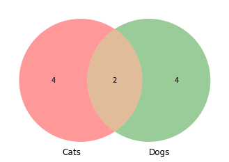
To create a simple Venn diagram containing the two dogs and cats sets, we can call the venn2() function and pass in two values: a list of sets and a tuple of set_labels. The list of sets needs to be a list with the set() function used to define the individual list. [set(df['cats'].to_list()), set(df['dogs'].to_list())] will handle this for us. The set_labels argument then takes the name for each column, i.e. Cats or Dogs.
venn2([set(df['cats'].to_list()),
       set(df['dogs'].to_list())],
       set_labels=('Cats', 'Dogs')
     )
<matplotlib_venn._common.VennDiagram at 0x7f5f5abe9730>
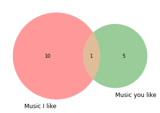
If you already know the amount of overlap between the two sets, you can instead use the subsets() function and state the numbers to show in the A, B, and AB sets. Here, I like 10 bands, you like 5 and we have 1 in common.
venn2(subsets = (10, 5, 1),
      set_labels = ('Music I like', 'Music you like'))
<matplotlib_venn._common.VennDiagram at 0x7f5f5ab6cc70>
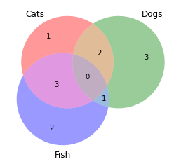
You can also use Venn diagrams for three sets of data. The approach for this is exactly the same, but there’s a different function called venn3() that needs to be used, since the underlying calculations are slightly different.
data = {'cats': ['Furry','Claws','Low maintenance','Not scary','Cannot do tricks','Quiet'],
        'dogs': ['Furry','Claws','High maintenance','Sometimes scary','Can do tricks','Noisy'],
        'fish': ['Scaly','No claws','Low maintenance','Sometimes scary','Cannot do tricks','Quiet']
       }
df = pd.DataFrame(data, columns = ['cats', 'dogs', 'fish'])
df.head()
| cats | dogs | fish | |
|---|---|---|---|
| 0 | Furry | Furry | Scaly |
| 1 | Claws | Claws | No claws |
| 2 | Low maintenance | High maintenance | Low maintenance |
| 3 | Not scary | Sometimes scary | Sometimes scary |
| 4 | Cannot do tricks | Can do tricks | Cannot do tricks |
venn3([set(df['cats'].to_list()),
       set(df['dogs'].to_list()),
       set(df['fish'].to_list()),
      ],
       set_labels=('Cats', 'Dogs', 'Fish')
     )
<matplotlib_venn._common.VennDiagram at 0x7f5f5a98b6d0>
Matt Clarke, Sunday, March 07, 2021


Other posts you might like

How to use the Pandas truncate() function
Have you ever needed to chop the top or bottom off a Pandas dataframe, or extract a specific section from the middle? If so, there’s a Pandas function called truncate()...

How to use Spacy for noun phrase extraction
Noun phrase extraction is a Natural Language Processing technique that can be used to identify and extract noun phrases from text. Noun phrases are phrases that function grammatically as nouns...