How to visualise data using scatterplots in Seaborn
Scatterplots are a great way to visualise the distribution of data and the relationship between two variables. Here’s how you create them in Seaborn.

Scatterplots, scatter graphs, scatter charts, or scattergrams, are one of the most popular mathematical plots and represent one of the best ways to visualise the relationship of data on two axes.
They’re commonly used in the exploratory data analysis (EDA) stage of data science as they allow the data scientist to see the distribution of data and look for relationships between variables from which a model could make a prediction.
The Seaborn data visualisation package is one of the most convenient ways to create attractive-looking scatterplots and you can create them using just a line or two of code. Here’s how it’s done.
Load the data
For this project we need three libraries. We’ll use Pandas for displaying the raw data in dataframes, and Matplotlib for creating the visualisations via the Seaborn wrapper. Seaborn basically sits on top of Matplotlib and handles lots of the basic things for you to make the process easier and your charts look better. Seaborn comes with a built-in data set including taxonomic data on Iris foliage which can be used to identify the species, and is ideal for scatterplots.
import pandas as pd
import seaborn as sns
import matplotlib.pyplot as plt
df = sns.load_dataset('iris')
df.head()
| sepal_length | sepal_width | petal_length | petal_width | species | |
|---|---|---|---|---|---|
| 0 | 5.1 | 3.5 | 1.4 | 0.2 | setosa |
| 1 | 4.9 | 3.0 | 1.4 | 0.2 | setosa |
| 2 | 4.7 | 3.2 | 1.3 | 0.2 | setosa |
| 3 | 4.6 | 3.1 | 1.5 | 0.2 | setosa |
| 4 | 5.0 | 3.6 | 1.4 | 0.2 | setosa |
When to use a scatterplot
Scatterplots are used for displaying data which has both an X (horizontal) and a y (vertical) axis, allowing you to see if there’s any relationship between the two values. They can be used to visualise a whole data set at once, a whole data set with different colours for each class, or a single group from within a data set. All you need to do is define the X and y accordingly.
They can fail to work adequately when there are hundreds of points placed very closely together, as the spots can overlap causing you to infer that there’s no clear boundary or distribution to the data. However, this can partly be avoided by changing the point size and colour, and by using joint plots or marginal plots, which map an additional chart onto the axes showing the spread of the data.
Creating scatterplots in Seaborn
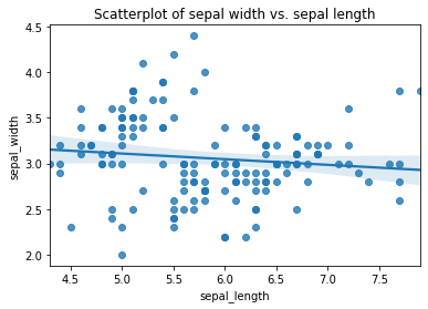
Here’s a really basic example, which includes a linear regression line. In Seaborn, they can be created using the regplot() function to which you pass the X and y series of your dataframe. Here we’re plotting the sepal_length and sepal_width for all species on a single scatterplot and Seaborn is automatically fitting a regression line showing the trend across species.
sns.regplot(x=df["sepal_length"],
            y=df["sepal_width"])
plt.title('Scatterplot of sepal width vs. sepal length')
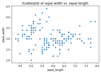
Seaborn includes various options for styling scatterplots. You can turn off the linear regression line if you wish by passing in the optional argument fit_reg=False, and you can change the marker from the default dot to a character of your choice using marker="*".
sns.regplot(x=df["sepal_length"],
            y=df["sepal_width"],
            fit_reg=False,
            marker="*")
plt.title('Scatterplot of sepal width vs. sepal length')
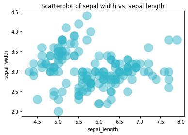
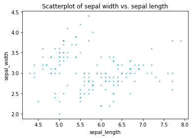
Similarly, you can change the colour of the points using the scatter_kws argument. Here I’ve set the colour of the dots to the hex code #32B5C9, increased the dot size to 300 points, and set the alpha transparency to 0.5 so you can see the overlap a bit more clearly. In the lower plot I’ve reduced the point size down, which can be useful when data are overlapping.
sns.regplot(x=df["sepal_length"],
            y=df["sepal_width"],
            fit_reg=False,
            scatter_kws={"color":"#32B5C9","alpha":0.5,"s":300}
           )
plt.title('Scatterplot of sepal width vs. sepal length')
sns.regplot(x=df["sepal_length"],
            y=df["sepal_width"],
            fit_reg=False,
            scatter_kws={"color":"#32B5C9","alpha":0.5,"s":5}
           )
plt.title('Scatterplot of sepal width vs. sepal length')
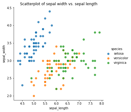
To display multiple categories of data on a single scatterplot, such as the species of Iris in this data set, you can substitute the regplot() function for lmplot() and pass in the hue argument with the column containing your categorical variable, i.e. species. This clearly separates out the sepal_width and sepal_length of the three species into distinct clusters that a model could use to identify the species.
sns.lmplot(x="sepal_length",
           y="sepal_width",
           data=df,
           hue='species',
           fit_reg=False)
plt.title('Scatterplot of sepal width vs. sepal length')
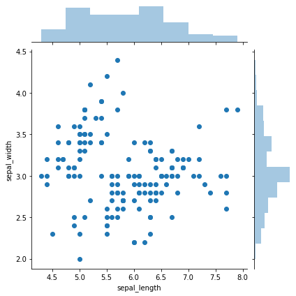
Creating jointplots
Joint plots or marginal plots allow you to append additional plots to the X and y axis of your scatterplot to better visualise the spread of the data. By default, the jointplot uses a scatterplot with a histogram on the X and y axis, which lets us see that most values lie within certain areas.
sns.jointplot(x=df["sepal_length"],
              y=df["sepal_width"],
              kind='scatter')
plt.title('Scatterplot of sepal width vs. sepal length')
Matt Clarke, Saturday, March 06, 2021


Other posts you might like

How to use the Pandas truncate() function
Have you ever needed to chop the top or bottom off a Pandas dataframe, or extract a specific section from the middle? If so, there’s a Pandas function called truncate()...

How to use Spacy for noun phrase extraction
Noun phrase extraction is a Natural Language Processing technique that can be used to identify and extract noun phrases from text. Noun phrases are phrases that function grammatically as nouns...