How to use knee point detection in k means clustering
Use the Kneedle algorithm to detect the knee or elbow point when k means clustering so you define the optimum number of clusters to create via the Kneed Python package.

When using the k means clustering algorithm, you need to specifically define k, or the number of clusters you want the algorithm to create. Rather than selecting an arbitrary value, such as the number of clusters you want for practical purposes, there’s a science to the selection of the optimum k.
The optimum number of clusters is typically identified visually using a data visualisation known as an elbow plot. The elbow plot is generated by fitting the k means model on a range of different k values (typically from 1 to 10 or 20, depending on your data) and then plotting the SSE for each cluster.
The inflection point in the plot is called the “elbow” or “knee” and is a good indication for the optimum k to use within your model to get the best fit. If it’s not spot on, the elbow or knee point will usually be very close to the optimum k.
The elbow or knee represents the point at which a higher k, or additional clusters, stop adding useful information and make the clusters harder to separate. However, on some datasets, this inflection point is not always easy to spot. Thankfully, the elbow or knee point can also be detected computationally using the Kneedle algorithm. Here’s how it’s done.
Load the packages
import pandas as pd
import numpy as np
import datetime as dt
import seaborn as sns
import matplotlib.pyplot as plt
from sklearn.preprocessing import StandardScaler
from sklearn.cluster import KMeans
from kneed import KneeLocator

sns.set(rc={'figure.figsize':(15, 6)})
Load the data
I’m using the Online Retail II dataset from the UCI
Machine Learning Repository for this project, which is provided as an Excel spreadsheet. We can load this into a Pandas DataFrame using the read_excel() function, and define the names of the columns we need to import.
To tidy up the names, I’ve used the Pandas rename() function to rename the dataframe columns and I have calculated the line_price value by multiplying the unit_price by the quantity. As there are some negative values in here, representing refunds, I’ve removed these from the data, so the later log transformation works correctly.
df = pd.read_excel('https://archive.ics.uci.edu/ml/machine-learning-databases/00502/online_retail_II.xlsx',
                  usecols=['Invoice','Quantity','InvoiceDate','Price','Customer ID'])
df = df.rename(columns={'Invoice':'order_id','Quantity':'quantity','InvoiceDate':'order_date',
                       'Price':'unit_price','Customer ID':'customer_id'})
df['line_price'] = df['unit_price'] * df['quantity']
df = df[df['line_price'] > 0]
df.tail()
| order_id | quantity | order_date | unit_price | customer_id | line_price | |
|---|---|---|---|---|---|---|
| 525456 | 538171 | 2 | 2010-12-09 20:01:00 | 2.95 | 17530.0 | 5.90 |
| 525457 | 538171 | 1 | 2010-12-09 20:01:00 | 3.75 | 17530.0 | 3.75 |
| 525458 | 538171 | 1 | 2010-12-09 20:01:00 | 3.75 | 17530.0 | 3.75 |
| 525459 | 538171 | 2 | 2010-12-09 20:01:00 | 3.75 | 17530.0 | 7.50 |
| 525460 | 538171 | 2 | 2010-12-09 20:01:00 | 1.95 | 17530.0 | 3.90 |
Engineer features to cluster
Next, we’ll engineer some raw RFM metrics showing each customer’s recency, frequency, and monetary value. There are several ways to do this, but the below method is very quick and easy. This gives us some raw data for our clustering model.
end_date = max(df['order_date']) + dt.timedelta(days=1)

df_rfm = df.groupby('customer_id').agg(
    recency=('order_date', lambda x: (end_date - x.max()).days),
    frequency=('order_id', 'count'),
    monetary=('line_price', 'sum')
)

df_rfm.head()
| recency | frequency | monetary | |
|---|---|---|---|
| customer_id | |||
| 12346.0 | 165 | 33 | 372.86 |
| 12347.0 | 3 | 71 | 1323.32 |
| 12348.0 | 74 | 20 | 222.16 |
| 12349.0 | 43 | 102 | 2671.14 |
| 12351.0 | 11 | 21 | 300.93 |
Preprocess the data
The k means algorithm assumes that variables are distributed symmetrically without skewing, and have similar average values and standard deviations. Since RFM metrics are typically highly skewed, we need to log transform the data in order to remove the skewness and make the statistical distribution a bit closer to a normal distribution.
To ensure the variables have a similar mean and standard deviation we can use the StandardScaler from scikit-learn. This is a bit quicker and easier than performing this step manually. The function below will log transform the data and then normalize it and return a transformed Pandas DataFrame that we can use in the next steps.
Log transforms only work when data are not zero or below, so you’ll need to remove these values or use a different log transform that can handle negative values.
def preprocess(df):
    """Preprocess data for KMeans clustering"""

    df_log = np.log1p(df)
    scaler = StandardScaler()
    scaler.fit(df_log)
    df_norm = scaler.transform(df_log)

    return df_norm
Create an elbow plot
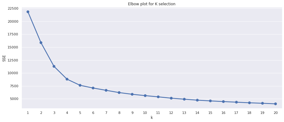
To create an elbow plot we need to fit a k means clustering model with a range of different k values and record a metric called SSE for each one. The SSE is the sum of the squared distance between the centroid (the point at the middle of the cluster) and each member of the cluster.
When the SSE for each k is plotted, we get a concave curve with decreasing SSE values. The inflection point of the curve identifies the optimum k - or a point very close to it. In very basic terms, after the inflection point, the SSE flattens out as more clusters are added, indicating that they’re contributing less to the separation of clearly defined clusters.
def elbow_plot(df):
    """Create elbow plot from normalized data"""

    df_norm = preprocess(df)

    sse = {}

    for k in range(1, 21):
        kmeans = KMeans(n_clusters=k, random_state=1)
        kmeans.fit(df_norm)
        sse[k] = kmeans.inertia_

    plt.title('Elbow plot for K selection')
    plt.xlabel('k')
    plt.ylabel('SSE')
    sns.pointplot(x=list(sse.keys()),
                 y=list(sse.values()))
    plt.show()
The function above will take our original Pandas DataFrame, run the preprocess() function above to log transform and normalize the data, then fit a k means model with each k value, and assign the SSE stored in kmeans.inertia_ to a dictionary called sse. We can then create a pointplot() using Seaborn and plot the sse.keys() on the x axis and the sse.values() on the y axis.
elbow_plot(df_rfm)
Computationally detecting the elbow or knee point
It’s not always completely obvious where the inflection point lies. It’s around four or five on the elbow plot above, I think. The usual approach is to select it by eye using the elbow plot, fit the model and examine the summary statistics for the clusters, then repeat the process using a different k from either side and see which k makes most sense from a business perspective.
However, there are actually a number of different ways to identify the inflection point in an elbow plot computationally, which takes out the guess work when it’s not obvious. Three common methods are the Silhouette Coefficient, the Calinski Harabasz score, and the Knee point detection or Kneedle algorithm.
 Picture by Lucaxx Freire, Unsplash.
The Kneedle algorithm
We’ll use the Kneedle algorithm here via Kevin Arvai’s excellent Python implementation called Kneed. You can download this via PyPi by
entering pip3 install kneed into your terminal and then importing the package with from kneed import KneeLocator.
The Kneedle algorithm (Satopaa et al., 2011) is a generic tool designed for the detection of “knees” in data. In clustering, the knee represents the point at which adding further clustering fails to add significantly more detail. However, in other fields, knees represent the point at which there’s a trade-off between spending money developing a system or product, and its performance improving significantly.
The actual k recommended by the Kneedle algorithm should be ideal. However, it’s good practice in k means clustering to examine a k value on either side to find the one which works best for the business aims. I’ve added a couple of optional arguments that either add or subtract from the k provided by the Kneedle algorithm to make this easy.
def find_k(df, increment=0, decrement=0):
    """Find the optimum k clusters"""

    df_norm = preprocess(df)
    sse = {}

    for k in range(1, 21):
        kmeans = KMeans(n_clusters=k, random_state=1)
        kmeans.fit(df_norm)
        sse[k] = kmeans.inertia_

    kn = KneeLocator(x=list(sse.keys()),
                 y=list(sse.values()),
                 curve='convex',
                 direction='decreasing')
    k = kn.knee + increment - decrement
    return k
Apply k means clustering
Finally, we can create a function to run our k means clustering model from end to end. This will take a Pandas DataFrame of parameters to cluster and will create the optimum number of clusters identified by the Kneedle algorithm. By providing optional arguments, we can bracket different k values either side of the identified value to compare what works best from a practical perspective.
The run_kmeans() function then preprocesses the data to ensure it’s in the optimum format for the k means algorithm, uses the Kneedle algorithm to identify the optimum number of clusters for the best fit, and returns a Pandas DataFrame containing the original data, with the cluster number added to a column on the end.
def run_kmeans(df, increment=0, decrement=0):
    """Run KMeans clustering, including the preprocessing of the data
    and the automatic selection of the optimum k.
    """

    df_norm = preprocess(df)
    k = find_k(df, increment, decrement)
    kmeans = KMeans(n_clusters=k,
                    random_state=1)
    kmeans.fit(df_norm)
    return df.assign(cluster=kmeans.labels_)
Run the model
The last step is to use the run_kmeans() function on our data and fit the model with the optimum k and the value either side. We can then generate aggregate summary statistics for each cluster in the datasets with different numbers of clusters and select the one that is most practical to use for business purposes.
First, we’ll run k means clustering using the optimum k identified by the Kneedle algorithm. To examine the clusters generated, we can use a groupby() on the newly created cluster column and then use the agg() function to calculate summary statistics for each cluster and order them by recency.
This gives us five clear clusters. Note that k means doesn’t order the cluster labels, so cluster 3 is the most recent and cluster 1 is the next most recent. The clusters created are fairly easy to distinguish, but this doesn’t mean that five represents the optimum number of clusters for practical marketing purposes.
clusters = run_kmeans(df_rfm)
clusters.groupby('cluster').agg(
    recency=('recency','mean'),
    frequency=('frequency','mean'),
    monetary=('monetary','mean'),
    cluster_size=('monetary','count')
).round(1).sort_values(by='recency')
| recency | frequency | monetary | cluster_size | |
|---|---|---|---|---|
| cluster | ||||
| 3 | 9.6 | 315.6 | 7947.5 | 656 |
| 1 | 20.0 | 40.1 | 627.3 | 834 |
| 2 | 66.3 | 122.3 | 2288.7 | 1028 |
| 4 | 166.5 | 31.9 | 543.3 | 1158 |
| 0 | 171.7 | 7.0 | 178.3 | 636 |
Passing in the optional increment=1 argument we can increase k by one and get six clusters back. Again, these would be usable, but they’re probably a bit too granular to be of use, so we’ll next try a smaller number of clusters.
clusters_increment = run_kmeans(df_rfm, increment=1)
clusters_increment.groupby('cluster').agg(
    recency=('recency','mean'),
    frequency=('frequency','mean'),
    monetary=('monetary','mean'),
    cluster_size=('monetary','count')
).round(1).sort_values(by='recency')
| recency | frequency | monetary | cluster_size | |
|---|---|---|---|---|
| cluster | ||||
| 2 | 10.7 | 96.4 | 1407.8 | 645 |
| 3 | 13.6 | 401.3 | 10578.7 | 471 |
| 4 | 36.4 | 24.2 | 451.8 | 830 |
| 0 | 77.6 | 108.1 | 2083.4 | 982 |
| 5 | 188.5 | 5.8 | 155.9 | 477 |
| 1 | 202.3 | 30.2 | 492.0 | 907 |
Using the optional decrement=1 argument we can reduce k by one and get back four clusters. Cluster 2 contains 925 very recent customers with high frequency and monetary values. Cluster 0 is less recenct and less frequent and has spent less, while cluster 3 has placed more orders and spent more, but hasn’t been so as recenctly. Finally, cluster 1 contains the lower value customers who are less frequent and recent and haven’t spent as much.
From a marketing perspective, even though this is technically lower than the “optimum” k, this clustering would arguably be the most practical choice for a marketing team, since it’s not too granular and the clusters are very clearly separated.
clusters_decrement = run_kmeans(df_rfm, decrement=1)
clusters_decrement.groupby('cluster').agg(
    recency=('recency','mean'),
    frequency=('frequency','mean'),
    monetary=('monetary','mean'),
    cluster_size=('monetary','count')
).round(1).sort_values(by='recency')
| recency | frequency | monetary | cluster_size | |
|---|---|---|---|---|
| cluster | ||||
| 2 | 15.0 | 274.9 | 6516.3 | 925 |
| 0 | 23.1 | 37.1 | 596.8 | 918 |
| 3 | 103.5 | 81.0 | 1548.9 | 1245 |
| 1 | 187.3 | 15.1 | 268.1 | 1224 |
Further reading
- Satopaa, V., Albrecht, J., Irwin, D. and Raghavan, B., 2011, June. Finding a” kneedle” in a haystack: Detecting knee points in system behavior. In 2011 31st international conference on distributed computing systems workshops (pp. 166-171). IEEE.
Matt Clarke, Friday, March 12, 2021


Other posts you might like

How to tune a LightGBMClassifier model with Optuna
The LightGBM model is a gradient boosting framework that uses tree-based learning algorithms, much like the popular XGBoost model. LightGBM supports both classification and regression tasks, and is known for...

How to create a customer retention model with XGBoost
Although all business know the importance of retaining customers, few companies are actually able to measure customer retention accurately, and fewer still can predict which ones will churn or be...