How to visualise RFM data using treemaps
Learn how to assign simple labels to your RFM data and visualise them using treemaps to help make the data easier for non-technical people to understand.

Recent papers on the Recency, Frequency, Monetary or RFM model, such as the one by Inanc Kabasakal in 2020, have started to adopt text-based labels to help people understand the customer segments. The benefit of labels is that non-technical people don’t need to know what RFM is or what the 125 possible scores relate to.
This is quite handy if you work with RFM scores a lot, because they’re not immediately intuitive to some stakeholders. Labels for RFM aren’t new. They’ve been around for years and I’m sure most RFM advocates have applied them in some way.
Kabasakal attributes the new ones to an analytics company called Putler. They proposed 11 segment names</a>which set out to define the sorts of customers that lie within. Inclusion in each segment depends on a combination of the R score range and the F and M score range.
| Customer segment | R score range | F and M score range |
| Champions | 4-5 | 4-5 |
| Loyal customers | 2-5 | 3-5 |
| Potential loyalist | 3-5 | 1-3 |
| Recent customers | 4-5 | 0-1 |
| Promising | 3-4 | 0-1 |
| Needing attention | 2-3 | 2-3 |
| About to sleep | 2-3 | 0-2 |
| At risk | 0-2 | 4-5 |
| Can't lose them | 0-1 | 4-5 |
| Hibernating | 1-2 | 1-2 |
| Lost | 0-2 | 0-2 |
They look quite useful, but oddly, if you try to implement them, you’ll encounter some issues, because the bounds overlap and the F and M score is additive. I definitely see the value in the labels, but I’m not entirely convinced this is the optimal solution.
For example, if Champions are those customers where R is 4-5 and F and M are 4-5, that would cover everyone who is 444 to 555. However, Loyal customers are defined as those where R is 2-5 and F and M are 3-5, so that would include everyone who is 233 to 555. As a result, a customer who is 444 or 555 could appear in either group. Similarly, does a 111 go in Lost or Hibernating, as the defines imply both? Perhaps I’m missing something…
Other approaches to naming RFM segments
Other naming conventions have also been proposed. For example, a recent PhD thesis on RFM by Umit Uysal (2019) split customers up as Stars, Loyal, Potential loyal, Hold and improve, and Risky. Unlike the Putler segments, Uysal’s don’t overlap or leave any gaps, so are more practical to implement. I’ve extracted the bounds from the paper to show this.
| Customer segment | RFM scores |
| Star | 542-555 |
| 455 | |
| Loyal | 541 |
| 511-535 | |
| 354-454 | |
| Potential loyal | 311-353 |
| Hold and improve | 211-255 |
| Risky | 111-155 |
You can, of course, set whatever bounds you like and come up with your own labels, but in this project I thought I’d show how you can create them and how you can use them to get an overview of where your customers lie, something which isn’t always that easy with RFM data.
Load your packages
For this project we can do nearly everything in Pandas, but to visualise our data we’ll need Matplotlib and a great treemap visualisation package called Squarify, which you can install by typing pip3 install squarify into your terminal.
import pandas as pd
import matplotlib.pyplot as plt
import squarify
Import your RFM scores
I’m going to assume you’ve already got your RFM scores. If you don’t know how to calculate Recency, Frequency, and Monetary metrics or you haven’t already converted them into the 125 quintile bins from 111 to 555, please check out my previous articles on quantile-based discretization and k-means clustering and calculating raw RFM data which explain how it’s done. Once you’ve done that, load up your data using Pandas.
df = pd.read_csv('rfm_scores.csv')
df.sample(5)
| customer_id | recency_date | recency | frequency | monetary | r | m | f | rfm | rfm_score | |
|---|---|---|---|---|---|---|---|---|---|---|
| 68909 | 320191 | 2019-05-17 10:39:03 | 535 | 1 | 31.29 | 2 | 2 | 2 | 222 | 6 |
| 104010 | 379219 | 2020-03-09 09:38:58 | 238 | 1 | 6.85 | 3 | 1 | 3 | 331 | 7 |
| 82870 | 341707 | 2020-06-10 14:24:34 | 145 | 2 | 167.62 | 4 | 5 | 5 | 455 | 14 |
| 26638 | 222614 | 2018-03-06 10:07:10 | 972 | 1 | 4.99 | 1 | 1 | 1 | 111 | 3 |
| 46884 | 251148 | 2018-09-05 13:28:23 | 789 | 1 | 15.00 | 1 | 1 | 1 | 111 | 3 |
Label the RFM segments
To label the segments we can create a simple function which uses if elif statements to assign the appropriate label to the segment depending on where it sits within the bounds I extracted from the Uysal paper.
def label_rfm_segments(rfm):

    if (rfm >= 111) & (rfm <= 155):
        return 'Risky'

    elif (rfm >= 211) & (rfm <= 255):
        return 'Hold and improve'

    elif (rfm >= 311) & (rfm <= 353):
        return 'Potential loyal'

    elif ((rfm >= 354) & (rfm <= 454)) or ((rfm >= 511) & (rfm <= 535)) or (rfm == 541):
        return 'Loyal'

    elif (rfm == 455) or (rfm >= 542) & (rfm <= 555):
        return 'Star'

    else:
        return 'Other'
Next, we can use a lambda() function to run our label_rfm_segments() function on our dataframe and pass in the RFM score and return the label and assign it to a new column called rfm_segment_name.
df['rfm_segment_name'] = df.apply(lambda x: label_rfm_segments(x.rfm), axis=1)
df.head()
| customer_id | recency_date | recency | frequency | monetary | r | m | f | rfm | rfm_score | rfm_segment_name | |
|---|---|---|---|---|---|---|---|---|---|---|---|
| 0 | 166958 | 2019-12-18 06:01:18 | 320 | 5 | 188.92 | 3 | 5 | 5 | 355 | 13 | Loyal |
| 1 | 191708 | 2020-04-11 07:49:24 | 205 | 15 | 683.79 | 3 | 5 | 5 | 355 | 13 | Loyal |
| 2 | 199961 | 2017-04-07 08:18:45 | 1305 | 1 | 16.99 | 1 | 2 | 1 | 112 | 4 | Risky |
| 3 | 199962 | 2017-04-07 08:20:00 | 1305 | 1 | 11.99 | 1 | 1 | 1 | 111 | 3 | Risky |
| 4 | 199963 | 2017-04-07 08:21:34 | 1305 | 1 | 14.49 | 1 | 1 | 1 | 111 | 3 | Risky |
Analyse the data
To examine what we have in each of our named segments we’ll use the agg() function and calculate some summary statistics. First we’ll check that the customers have been assigned the correct segment label by counting the number with each label and looking at the minimum and maximum RFM scores in each cluster.
The splits here will, of course, depend on the binning or clustering method you used to create your scores. Quantile-based discretization will give you more even numbers than K-means clustering, but the latter is often more useful.
df.groupby('rfm_segment_name').agg(
    customers=('customer_id', 'count'),
    min_rfm=('rfm', 'min'),
    max_rfm=('rfm', 'max'),
).reset_index().sort_values(by='min_rfm')
| rfm_segment_name | customers | min_rfm | max_rfm | |
|---|---|---|---|---|
| 3 | Risky | 36070 | 111 | 155 |
| 0 | Hold and improve | 36057 | 211 | 255 |
| 2 | Potential loyal | 29877 | 321 | 353 |
| 1 | Loyal | 42888 | 354 | 541 |
| 4 | Star | 35566 | 455 | 555 |
The other really useful thing, and the number one thing that sales staff and marketers will ask for, are the details on the underlying data and how it impacts the assignation of the segment label. For example, how much do you need to spend to become a “Star”?
df.groupby('rfm_segment_name').agg(
    min_recency=('recency', 'min'),
    max_recency=('recency', 'max'),
    min_frequency=('frequency', 'min'),
    max_frequency=('frequency', 'max'),
    min_monetary=('monetary', 'min'),
    max_monetary=('monetary', 'max'),
).reset_index().sort_values(by='min_recency')
| rfm_segment_name | min_recency | max_recency | min_frequency | max_frequency | min_monetary | max_monetary | |
|---|---|---|---|---|---|---|---|
| 1 | Loyal | 13 | 442 | 1 | 46 | 0.0 | 9719.65 |
| 4 | Star | 13 | 195 | 1 | 392 | 0.0 | 1036590.86 |
| 2 | Potential loyal | 196 | 442 | 1 | 5 | 0.0 | 5389.95 |
| 0 | Hold and improve | 443 | 782 | 1 | 38 | 0.0 | 11234.70 |
| 3 | Risky | 783 | 1305 | 1 | 147 | 0.0 | 10247.25 |
This shows that our “Hold and improve” segment contains customers who haven’t been seen for between 443 and 782 days, so are likely to be lapsed, while those in the “Risky” pot, haven’t been seen for 783 to 1305 days, so are probably long churned. I think this shows the benefit of choosing your own labels over using standardised ones. They don’t work on every data set, especially ones with a long tail of lapsed customers.
Visualising the segments using a treemap
Now we’ve assigned Uysal’s RFM segment labels to the customers in our data set we’ll create a treemap to visualise the data. First, we’ll create a new dataframe called df_treemap that includes the count of the total customers within each RFM segment, then we’ll use Matplotlib and Squarify to create a treemap visualisation.
df_treemap = df.groupby('rfm_segment_name').agg(
    customers=('customer_id', 'count')
).reset_index()
df_treemap.head()
| rfm_segment_name | customers | |
|---|---|---|
| 0 | Hold and improve | 36057 |
| 1 | Loyal | 42888 |
| 2 | Potential loyal | 29877 |
| 3 | Risky | 36070 |
| 4 | Star | 35566 |
fig, ax = plt.subplots(1, figsize = (10,10))

squarify.plot(sizes=df_treemap['customers'],
              label=df_treemap['rfm_segment_name'],
              alpha=.8,
              color=['tab:red', 'tab:purple', 'tab:brown', 'tab:pink', 'tab:gray']
             )
plt.axis('off')
plt.show()
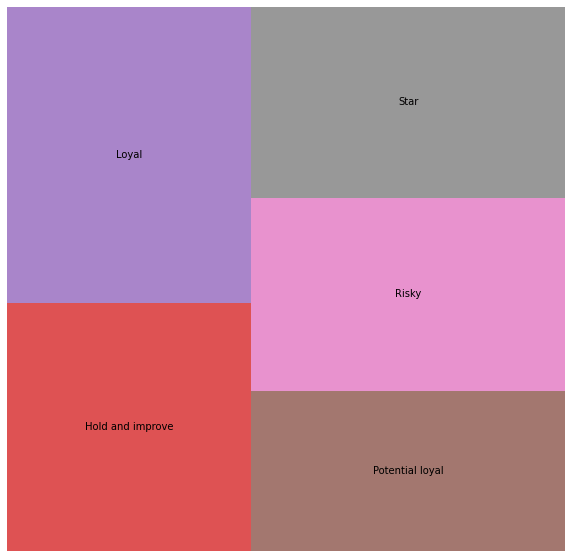
The treemap gives us a really clear view of the named RFM segments and the relative volumes of customers present in each one. For this particular data set, where the tail is long and there are likely to be loads of truly lapsed customers in the “Risky” and “Hold and improve” segments, it could be beneficial to use an alternative binning approach so that the lapsed customers are dumped into a “churned” segment and can be excluded from costly marketing activity.
Further reading
-
Kabaskal, İ., 2020. Customer Segmentation Based On Recency Frequency Monetary Model: A Case Study in E-Retailing. International Journal of InformaticsTechnologies, 13(1).
-
Putler Analytics – RFM analysis for successful customer segmentation, https://www.putler.com/rfm-analysis, 26.04.2019.
-
Uysal, Ü.C., 2019. RFM-based Customer Analytics in Public Procurement Sector (Doctoral dissertation, Ankara Yıldırım Beyazıt Üniversitesi Sosyal Bilimler Enstitüsü).
Matt Clarke, Saturday, March 06, 2021


Other posts you might like

How to use the Pandas truncate() function
Have you ever needed to chop the top or bottom off a Pandas dataframe, or extract a specific section from the middle? If so, there’s a Pandas function called truncate()...

How to use Spacy for noun phrase extraction
Noun phrase extraction is a Natural Language Processing technique that can be used to identify and extract noun phrases from text. Noun phrases are phrases that function grammatically as nouns...