How to visualise analytics data using heatmaps in Seaborn
Heatmaps make visualising temporal data much easier. Here’s how you can create custom web analytics heatmaps using GAPandas and Seaborn.

Heatmaps are one of the most intuitive ways to display data across two dimensions, and they work particularly well on temporal data, such as web analytics metrics. They’re a great way to visualise web metrics and allow you to spot trends and patterns without the need to go over any numbers. Here’s how you can create them using Seaborn and GAPandas.
Load the packages
For this project we’ll be using GAPandas to fetch data from the Google Analytics reporting API, Pandas for displaying the tabular data in dataframes, and Seaborn and Matplotlib for data visualisation using heatmaps.
import pandas as pd
import seaborn as sns
import matplotlib.pyplot as plt
from gapandas import connect, query
Fetch the data
First, obtain your client_secrets.json key for a Service Account and ensure the email address associated with it is present in your Google Analytics account. Then format an API query payload to fetch your data. To display data on a heatmap you need two categorical columns, such as the year and month, or hour and day, and one metric. We’ll start off by fetching data for sessions for each month over the past few years.
service = connect.get_service('personal_client_secrets.json')
payload = {
    'start_date': '2017-01-01',
    'end_date': '2020-10-31',
    'metrics': 'ga:sessions',
    'dimensions': 'ga:year, ga:month'
}

df = query.run_query(service, '101646265', payload)
46
We’ll need to do a bit of reformatting on the data returned by GAPandas to ensure the year, month and sessions are set to the correct data type. You can check the data types by entering df.info().
df['year'] = df['year'].astype(int)
df['month'] = df['month'].astype(int)
df['sessions'] = df['sessions'].astype(int)
df.head()
| year | month | sessions | |
|---|---|---|---|
| 0 | 2017 | 1 | 3907 |
| 1 | 2017 | 2 | 3822 |
| 2 | 2017 | 3 | 4989 |
| 3 | 2017 | 4 | 6181 |
| 4 | 2017 | 5 | 6312 |
Re-shape from long to wide
Next we need to re-shape our data from the current long format to wide format. There are several ways to do this, but the easiest is to use the pivot() function. We’ll run pivot() on the dataframe, set the year as the index column, set the columns to be the month number and the values within to be the sessions metrics. Finally, we will fill any missing values with 0 and set the data type to int.
df_monthly = df.pivot(index='year', columns='month', values='sessions').fillna(0).astype(int)
df_monthly
| month | 1 | 2 | 3 | 4 | 5 | 6 | 7 | 8 | 9 | 10 | 11 | 12 |
|---|---|---|---|---|---|---|---|---|---|---|---|---|
| year | ||||||||||||
| 2017 | 3907 | 3822 | 4989 | 6181 | 6312 | 5249 | 4693 | 5346 | 4885 | 5802 | 5383 | 5044 |
| 2018 | 7316 | 6735 | 7905 | 9050 | 9669 | 9695 | 9866 | 13227 | 11994 | 11975 | 11156 | 11873 |
| 2019 | 15209 | 15645 | 18539 | 17563 | 18534 | 18460 | 18400 | 17060 | 14235 | 14257 | 12662 | 11233 |
| 2020 | 14650 | 15516 | 17029 | 15555 | 28553 | 32476 | 30106 | 26461 | 23159 | 20839 | 0 | 0 |
Create a monthly sessions heatmap
Now our data is in the right format we can use Seaborn and Matplotlib to visualise it on a heatmap. As our heatmap includes the metrics on each tile, it’s worth defining the size of the heatmap image to ensure it is legible. We can do this with f, ax = plt.subplots(figsize=(20, 5)), which sets the heatmap to 20 inches by 5 inches. There are many colour palettes available for Seaborn, but I’d highly recommend you choose one which starts pale and gets darker, otherwise your heatmap will be harder to decipher.
Next we’ll use the Seaborn heatmap() function to create the heatmap itself. We pass in the df_monthly dataframe in wide format, set annotations to appear using annot=True, set the formatting to d using fmt="d", pass in the ax settings and the colour map with cmap, and set the tiles to be displayed as squares. Finally, we use a bit of Matplotlib code to add in a custom title and named axes.
f, ax = plt.subplots(figsize=(20, 5))
cmap = sns.color_palette("Blues")

monthly_sessions = sns.heatmap(df_monthly,
                    annot=True,
                    fmt="d",
                    linewidths=5,
                    ax=ax,
                    cmap=cmap,
                    square=True)

ax.axes.set_title("Sessions by month and year",fontsize=20)
ax.set_xlabel("Month",fontsize=15)
ax.set_ylabel("Year",fontsize=15)
plt.show()
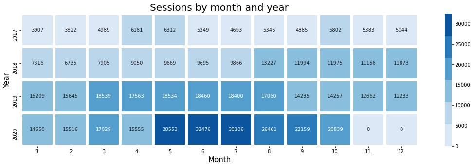
As you can see from the above heatmap, we get back a visualisation with a row per year and one tile representing each calendar month. The sessions are printed onto each tile and they change in colour from pale blue to dark blue depending on the number of sessions. This makes it really easy to see when the site traffic was busiest.
Fetch more data
To expand upon the above example we’ll now create another heatmap showing how sessions vary for each hour and day. The query we pass to the Google Analytics API via GAPandas is very similar, but we specify the dayOfWeekName and the hour.
payload = {
    'start_date': '2017-01-01',
    'end_date': '2020-10-31',
    'metrics': 'ga:sessions',
    'dimensions': 'ga:dayOfWeekName, ga:hour'
}

df = query.run_query(service, '101646265', payload)
168
As with the previous example, we need to do a little modification to the data returned from GAPandas to ensure it’s in the right format for plotting onto the heatmap. All that is required is setting the hour and session column to int using the astype() function.
df['hour'] = df['hour'].astype(int)
df['sessions'] = df['sessions'].astype(int)
Re-shape the data
Again, as we need the data to be in wide format instead of long format, we need to re-shape it. We can do this using pivot() again. We’ll set the index to the dayOfWeekName, set the columns to be the hour value and the metric to be the sessions. Any missing values will be filled with a 0 using fillna() and the data set to int using astype(). As we need to manipulate the dayOfWeekName column, we’ll reset the index.
df_hourly = df.pivot(index='dayOfWeekName', columns='hour', values='sessions').fillna(0).astype(int)
df_hourly.reset_index()
| hour | dayOfWeekName | 0 | 1 | 2 | 3 | 4 | 5 | 6 | 7 | 8 | ... | 14 | 15 | 16 | 17 | 18 |
|---|---|---|---|---|---|---|---|---|---|---|---|---|---|---|---|---|
| 0 | Friday | 1879 | 1500 | 1446 | 1326 | 1219 | 1529 | 2021 | 2594 | 2932 | ... | 4280 | 4347 | 4449 | 4591 | 4868 |
| 1 | Monday | 2187 | 1881 | 1596 | 1533 | 1416 | 1581 | 2059 | 2629 | 3109 | ... | 4759 | 5162 | 5064 | 5206 | 6087 |
| 2 | Saturday | 1934 | 1536 | 1376 | 1270 | 1249 | 1482 | 2063 | 2703 | 3167 | ... | 4659 | 4771 | 4948 | 5057 | 5002 |
| 3 | Sunday | 2069 | 1774 | 1460 | 1309 | 1315 | 1452 | 2055 | 2802 | 3557 | ... | 4931 | 5390 | 5680 | 5718 | 6231 |
| 4 | Thursday | 1862 | 1597 | 1510 | 1367 | 1388 | 1562 | 2028 | 2486 | 2958 | ... | 4496 | 4520 | 4581 | 4567 | 4948 |
| 5 | Tuesday | 2120 | 1707 | 1671 | 1504 | 1506 | 1656 | 2198 | 2650 | 3078 | ... | 4690 | 4715 | 4788 | 5043 | 5671 |
| 6 | Wednesday | 1873 | 1645 | 1587 | 1439 | 1394 | 1611 | 2071 | 2648 | 2910 | ... | 4342 | 4657 | 4597 | 4692 | 5245 |
7 rows × 25 columns
Order the days of the week correctly
The issue with the dataframe above is that the dayOfWeekName values are not in the correct order - they go Friday, Monday, Saturday etc. This will make our heatmap very confusing, so we now need to re-order them. After some head scratching, I figured out a really easy way to do this. By creating a list of days and listing them in the correct order, you can do a groupby() on the data using the dayOfWeekName and then pass the days list in to the reindex() function. This re-orders the weekdays so they’re in the right order.
days = ['Monday', 'Tuesday', 'Wednesday', 'Thursday', 'Friday', 'Saturday', 'Sunday']
df_hourly = df_hourly.groupby(['dayOfWeekName']).sum().reindex(days)
df_hourly.head()
| hour | 0 | 1 | 2 | 3 | 4 | 5 | 6 | 7 | 8 | 9 | ... | 14 | 15 | 16 | 17 | 18 |
|---|---|---|---|---|---|---|---|---|---|---|---|---|---|---|---|---|
| dayOfWeekName | ||||||||||||||||
| Monday | 2187 | 1881 | 1596 | 1533 | 1416 | 1581 | 2059 | 2629 | 3109 | 3615 | ... | 4759 | 5162 | 5064 | 5206 | 6087 |
| Tuesday | 2120 | 1707 | 1671 | 1504 | 1506 | 1656 | 2198 | 2650 | 3078 | 3477 | ... | 4690 | 4715 | 4788 | 5043 | 5671 |
| Wednesday | 1873 | 1645 | 1587 | 1439 | 1394 | 1611 | 2071 | 2648 | 2910 | 3291 | ... | 4342 | 4657 | 4597 | 4692 | 5245 |
| Thursday | 1862 | 1597 | 1510 | 1367 | 1388 | 1562 | 2028 | 2486 | 2958 | 3320 | ... | 4496 | 4520 | 4581 | 4567 | 4948 |
| Friday | 1879 | 1500 | 1446 | 1326 | 1219 | 1529 | 2021 | 2594 | 2932 | 3295 | ... | 4280 | 4347 | 4449 | 4591 | 4868 |
5 rows × 24 columns
Create the heatmap
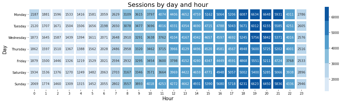
The final step, which is just a simple modification of the previous heatmap, is to pass in the df_hourly dataframe which is now in wide format with correctly ordered weekdays and then use Seaborn to create the visualisation. We get back a heatmap showing the hourly sessions for each day of the week over the past few years, allowing us to clearly visualise when the site is busiest.
f, ax = plt.subplots(figsize=(20, 5))
cmap = sns.color_palette("Blues")

monthly_sessions = sns.heatmap(df_hourly,
                    annot=True,
                    fmt="d",
                    linewidths=5,
                    ax=ax,
                    cmap=cmap,
                    square=True)

ax.axes.set_title("Sessions by day and hour",fontsize=20)
ax.set_xlabel("Hour",fontsize=15)
ax.set_ylabel("Day",fontsize=15)
plt.show()
Matt Clarke, Saturday, March 06, 2021


Other posts you might like

How to use the Pandas truncate() function
Have you ever needed to chop the top or bottom off a Pandas dataframe, or extract a specific section from the middle? If so, there’s a Pandas function called truncate()...

How to use Spacy for noun phrase extraction
Noun phrase extraction is a Natural Language Processing technique that can be used to identify and extract noun phrases from text. Noun phrases are phrases that function grammatically as nouns...