How to create ecommerce anomaly detection models
Learn how to use the Anomaly Detection Toolkit (ADTK) to identify anomalies in ecommerce data extracted from your Google Analytics account.

In the ecommerce sector, one of the most common tasks you’ll undertake after arriving at work each morning is to check over the recent analytics data for your site and look for anomalies. If a metric or KPI has gone up or down, you’ll want to identify it quickly and find out what caused it, so you can fix the issue or let your team know that their hard work has paid off.
While you can manually identify anomalies through the visualisation tools in Google Analytics, few people have enough time to pore over every metric and look for potentially anomalous data. Therefore, some issues may escape your attention until you compile your weekly or monthly reports.
The Google Analytics Alerts system is one way of staying on top of anomalies, as is the Analytics Intelligence insights panel. These can often flag up positive and negative anomalies for you to investigate. However, there are also several computational anomaly detection techniques you can utilise to automatically detect anomalies in time series data to make this process more automated, allowing you to customise the anomalies you detect and set threshold limits.
The standard machine learning techniques for anomaly detection or outlier detection are algorithms such as decision trees and k nearest neighbour techniques. However, there are also specific algorithms designed almost entirely with anomaly detection in mind, so for this project we’ll be trying these out.
We’ll create some Python anomaly detection code to extract current data from your Google Analytics account using GAPandas and the GA API, and then test a range of anomaly detection techniques in the Anomaly Detection Toolkit (ADTK) to find the one best suited to the data, and then use the model to identify recent anomalies.
Types of anomaly
One of the things that makes time series anomaly detection challenging is that anomalies come in many forms. The ones we see most often are the sudden spikes or drops in a metric caused by outlier anomalies, perhaps because something has gone wrong with a site deployment, or a page on the site has suddenly generated a shed load of social traffic. However, anomalies are much broader than this. Here are some you might encounter.
Outlier anomalies
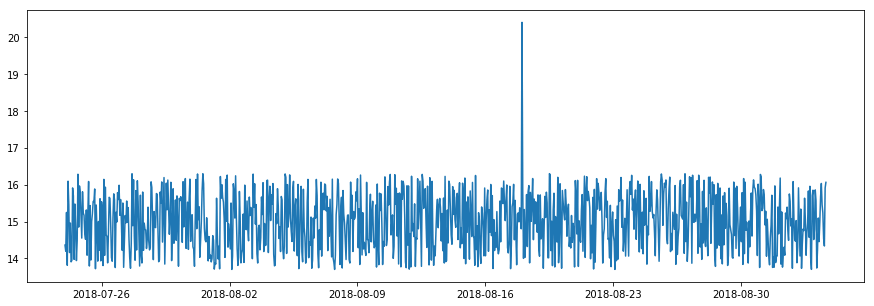
The outlier anomaly is the regular one everyone is aware of. It’s simply a data point that significantly differs from others in a time series. Outliers can be detected using the outlier detection models such as the ThresholdAD model which finds outliers that match a user-defined upper or lower threshold, or with the QuantileAD, InterQuartileRangeAD, or GeneralizedESDTestAD models, which learn the normal range from historical data and then flag anything unusual.
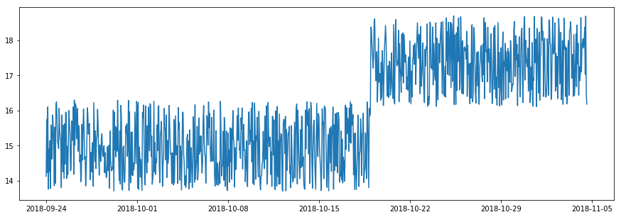
Spike and level shift anomalies
Spikes are a specific type of outlier anomaly in which the value abruptly increases or decreases to a point outside the range of the near past. When this happens temporarily it’s known as a spike.
A level shift anomaly can follow a spike anomaly, but rather than resulting in a very quick spike in which the metric suddenly returns to the usual level of the near past, the value of the spike shifts the normal level upwards or downwards to a new normal. Spikes and level shifts can be detected with specific anomaly detection models, such as PersistAD and LevelShiftAD.
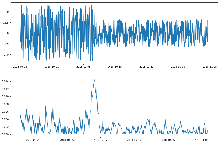
Pattern change anomalies
Pattern change anomalies are those in which the usual spread of data suddenly changes, as shown in the visualisation below. Again, to look for pattern change anomalies there are special models you can use, such as the RollingAggregate and DoubleRollingAggregate outlier detection models, which examines a range of statistics over rolling time windows.
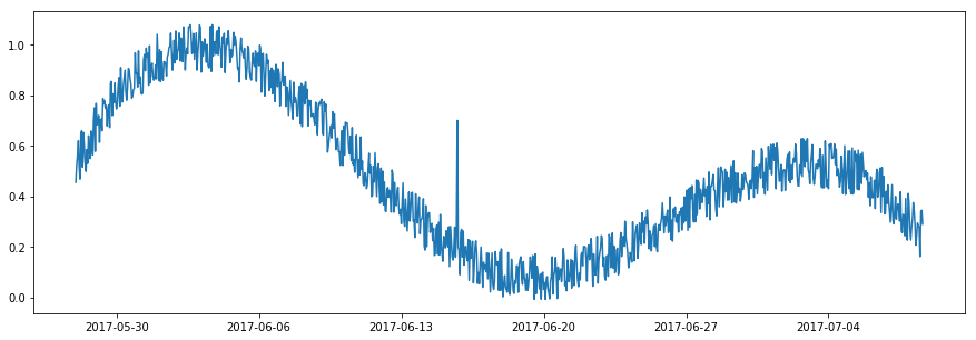
Seasonality anomalies
There are loads of seasonal anomalies in ecommerce data. They can be hourly, daily, weekly, or monthly and can be triggered by marketing, inbound links, the weather, national holidays or seasonal shopping events, and pandemics…
The usual method for detecting seasonal anomalies in your data points is to use seasonal decomposition. This aims to remove the seasonality from the time series and identify the periods in which the time series doesn’t follow a seasonal pattern. It’s not always trivial to pull of, in my experience.
As there are so many kinds of anomaly, with different algorithms developed specifically to identify each type, one of the first objectives is to understand what kinds of anomaly are likely to occur within the time series metric you’re examining. Once you know this, you can then select the right anomaly detection algorithm to use in your model.
Some outlier detection models can pick up several types of anomaly, if you adjust them accordingly, but you may need to run several alongside each other to get the optimal results, depending on what anomalies are likely to occur within the specific metrics you wish to monitor.
 Picture by Christina Morillo, Pexels.
Load the packages
For this project we’re using Pandas for displaying and manipulating data, GAPandas for querying the Google Analytics API to fetch our ecommerce data, the Anomaly Detection Toolit (ADTK) for detecting anomalies, and a few packages from scikit-learn for extending the ADTK models. Any packages you don’t have can be installed by entering pip3 install package-name.
ADTK includes a range of tools for building supervised and unsupervised time series anomaly detection models. Some of these are rule-based, and others use supervised learning, but it’s the unsupervised models that are most applicable to ecommerce, since we generally have a lack of labeled anomalous data points available for training our models.
import pandas as pd
from gapandas import connect, query
from adtk.data import validate_series
from adtk.visualization import plot
from adtk.detector import ThresholdAD
from adtk.detector import QuantileAD
from adtk.detector import InterQuartileRangeAD
from adtk.detector import PersistAD
from adtk.detector import LevelShiftAD
from adtk.detector import VolatilityShiftAD
from adtk.detector import SeasonalAD
from adtk.detector import AutoregressionAD
from adtk.detector import MinClusterDetector
from adtk.detector import OutlierDetector
from sklearn.neighbors import LocalOutlierFactor
from sklearn.cluster import KMeans
Fetch the data
We’re looking at time series anomalies, so we obviously need a time series dataset. You can use any one you like. I’m using GAPandas to fetch data from my blog’s Google Analytics account using the GA API. For tips on getting GAPandas up and running, check out my other tutorial.
Once we’ve formatted the payload of the query, we’ll run this using query.run_query() and make some changes to the dataframe returned to ensure it’s in the right format for ADTK.
The date column needs to be transformed to a datetime and this needs to be set as the index, while any metric columns you intend to plot need to be int or float values if they’re not already.
service = connect.get_service('personal_client_secrets.json')

payload = {
    'start_date': '2017-01-01',
    'end_date': '2020-10-31',
    'metrics': 'ga:sessions',
    'dimensions': 'ga:date'
}

df = query.run_query(service, '123456789', payload)
df['date'] = pd.to_datetime(df['date'])
df['sessions'] = df['sessions'].astype(int)
df = df.set_index('date')
df.head()
| sessions | |
|---|---|
| date | |
| 2017-01-01 | 130 |
| 2017-01-02 | 137 |
| 2017-01-03 | 126 |
| 2017-01-04 | 143 |
| 2017-01-05 | 153 |
Validate the time series
Before you create any models using ADTK you need to validate the time series data using the validate_series() function. This will check the data points and data format for critical issues in the data and automatically fix any issues it can, or raise errors for those it can’t. To use validate_series() we simply pass in the column (or series) from our dataframe that we wish to examine for anomalies, which is sessions in our case.
s = validate_series(df['sessions'])
Plot the data
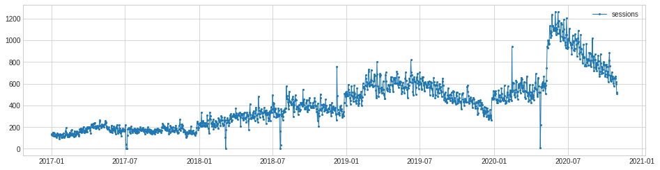
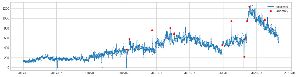
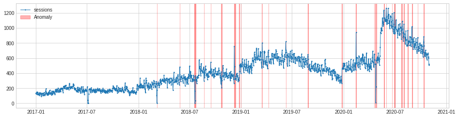
To get a feel for the raw data points we’ll use the plot() function from ADTK to chart the time series and visually identify any anomalies. As the line plot below shows, the traffic to my blog is trending upwards and has some seasonality to it. There appear to be several anomalies in the data, and they are of various types.
We have a number of outlier or spike anomalies, which might represent sudden increases in traffic from social media, or server outages. There’s also an interesting level shift anomaly in the early summer of 2020, which may be related to the pandemic. When the lockdown was lifted, traffic shot about and stayed high for the rest of the summer, before gradually returning to more normal levels.
chart = plot(s, ts_linewidth=1, ts_markersize=4)
Choosing the right anomaly detection algorithm
As we saw above, there are different types of anomaly detection algorithm aimed at detecting specific types of anomaly, so we need to try to identify one that spots the spike or outlier anomalies, as well as the level shift anomaly, with sufficient accuracy.
Threshold anomaly detection
The simplest method is called threshold anomaly detection. This requires that you manually define the lower and upper thresholds for what you consider an anomaly. To use this method, we first use the validate_series() function to validate the time series data in the column we want to plot. This requires that there’s a single column of metric data, with the date stored in a datetime index.
s = validate_series(df['sessions'])
Once that’s set up, we can run the ThresholdAD() function to create a threshold anomaly detection model in which the lower bound for an anomaly is 100 sessions, and the upper bound for an anomaly is 1000 sessions. When the model has been fitted to the data, the detect() function is used to identify the anomalous data.
threshold_ad = ThresholdAD(low=100, high=1000)
anomalies = threshold_ad.detect(s)
If we use to_frame() to turn this Series into a dataframe, we see that it has a datetime index and a True or False value for each date, depending on whether the sessions value was above or below the anomaly threshold set.
anomalies.to_frame().head()
| sessions | |
|---|---|
| date | |
| 2017-01-01 | False |
| 2017-01-02 | False |
| 2017-01-03 | False |
| 2017-01-04 | False |
| 2017-01-05 | False |
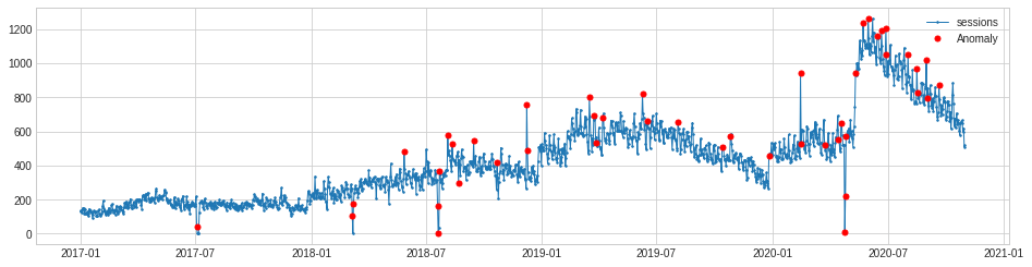
The plot() function below lets us visualise the time series data points and mark the anomalies in red. As you can see, it’s correctly marked the lower bound anomalies, but as there’s an upward trend to our data, it’s missed quite a few of the anomalies, mostly due to the strong upwards trend in the traffic level.
The threshold anomaly detection method obviously isn’t perfect for this metric. It would better suit a variable in which there was less of a trend and where the value being monitored was fairly constant.
chart = plot(s,
     anomaly=anomalies,
     ts_linewidth=1,
     ts_markersize=3,
     anomaly_markersize=5,
     anomaly_color='red',
     anomaly_tag='marker')
Quantile anomaly detection
Next we’ll try quantile anomaly detection using the QuantileAD model. This works in a similar way to threshold anomaly detection, but allows us to set the upper and lower thresholds as a percentage instead of a real value.
In the example below we’ll set the anomalies to be those below the 1% percentile and above the 99% percentile. This obviously gives similar results to the model above, but is a bit more practical for everyday use and can easily be tweaked to suit your requirements.
As it’s looking over the whole time period, it could give very realistic results if you chose to examine a shorter window than the three-year period I’ve selected, as seasonality here would likely be much lower.
quantile_ad = QuantileAD(low=0.01, high=0.99)
anomalies = quantile_ad.fit_detect(s)
chart = plot(s,
     anomaly=anomalies,
     ts_linewidth=1,
     ts_markersize=3,
     anomaly_markersize=5,
     anomaly_color='red',
     anomaly_tag='marker')
Inter-quartile range anomaly detection
The InterQuartileRangeAD detector is another commonly used one, and is based on the interquartile range or IQR. This is the area of data shown within box plots and lies between 25% and 75%. This model doesn’t require many outliers to be present in the training data and can even handle datasets that contain no outliers.
iqr_ad = InterQuartileRangeAD(c=1.5)
anomalies = iqr_ad.fit_detect(s)
chart = plot(s,
     anomaly=anomalies,
     ts_linewidth=1,
     ts_markersize=3,
     anomaly_markersize=5,
     anomaly_color='red',
     anomaly_tag='marker')

Persist anomaly detection
The PersistAD model uses a DoubleRollingAggregate model internally and detects anomalies by examining the previous values in the time series. By default, PersistAD is very near-sighted and checks only three previous values. This works well at capturing short-term anomalies, but will miss longer term changes. However, this feature can be adjusted to cope with noisier data.
persist_ad = PersistAD(c=3.0, side='positive')
anomalies = persist_ad.fit_detect(s)
chart = plot(s,
     anomaly=anomalies,
     ts_linewidth=1,
     ts_markersize=3,
     anomaly_markersize=5,
     anomaly_color='red',
     anomaly_tag='marker')
Although they appear to be missing from the ADTK documentation, there are several parameters you can pass to the PersistAD function. The c parameter (which isn’t named in the code) takes an optional float value and is used to determine the bound of the normal range based on the historical interquartile range. It defaults to 3.0, but can be adjusted to make it more or less sensitive.
Similarly, the side argument can be used to look for anomalies in both directions, or only positive or negative ones. Setting the side argument to both and the c argument to 2 gives much better results and looks almost spot on for our purposes.
persist_ad = PersistAD(c=2, side='both')
anomalies = persist_ad.fit_detect(s)
chart = plot(s,
     anomaly=anomalies,
     ts_linewidth=1,
     ts_markersize=3,
     anomaly_markersize=5,
     anomaly_color='red',
     anomaly_tag='marker')
The other setting you can change with PersistAD is the window. This sets the size of the preceding time window. It defaults to 1 but you can pass any any int value so the model looks at a longer time window.
persist_ad.window = 30
anomalies = persist_ad.fit_detect(s)
chart = plot(s,
     anomaly=anomalies,
     ts_linewidth=1,
     ts_markersize=3,
     anomaly_markersize=5,
     anomaly_color='red')
Level shift anomaly detection
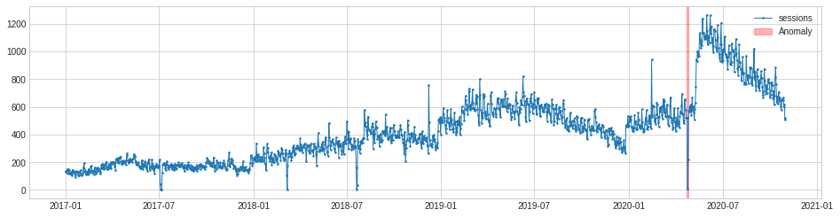
One of the anomalies in this dataset is rather different to the rest. In the summer of 2020, traffic to my blog suddenly increased to a new normal level. This seems to be correlated with the relaxing of pandemic lockdown rules. Whatever the cause, it triggered a level shift anomaly.
The level shift anomaly detection identifies this perfectly, but obviously ignores the others. If you specifically want to identify only level shift anomalies this may be handy. As with PersistAD you can change the window period and report only positive or negative level shift changes if you wish.
level_shift_ad = LevelShiftAD(c=6.0, side='both', window=5)
anomalies = level_shift_ad.fit_detect(s)
chart = plot(s,
     anomaly=anomalies,
     ts_linewidth=1,
     ts_markersize=3,
     anomaly_markersize=5,
     anomaly_color='red')

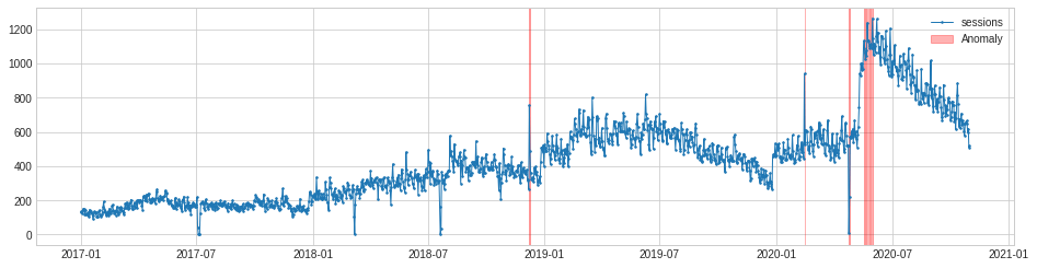
Volatility shift anomaly detection
The VolatilityShiftAD model is similar to PersistAD in that it uses an internal DoubleRollingAggregate model as a pipenet. It basically compares two time windows next to each other and identifies the time point between them as a volatility shift point, if the difference between them is anomalously large.
volatility_shift_ad = VolatilityShiftAD(c=6.0, side='positive', window=30)
anomalies = volatility_shift_ad.fit_detect(s)
The VolatilityShiftAD model only picks up one anomaly, but it’s arguably a false positive, representing a server outage that caused traffic to drop, rather than a true change in volatility.
chart = plot(s,
     anomaly=anomalies,
     ts_linewidth=1,
     ts_markersize=3,
     anomaly_markersize=5,
     anomaly_color='red')
Seasonal anomaly detection
The SeasonalAD model aims to detect anomalies that fall outside seasonal patterns. It uses a seasonal decomposition transformer to remove the trend and the seasonality from the data, and then identifies time points as anomalous when the residual decomposition is anomalously large. It takes a bit of tweaking to get it working, through adjusting the c parameter so it’s sensitive enough to spot all anomalies.
seasonal_ad = SeasonalAD(c=2, side="both", trend=True)
anomalies = seasonal_ad.fit_detect(s)
chart = plot(s,
     anomaly=anomalies,
     ts_linewidth=1,
     ts_markersize=3,
     anomaly_markersize=5,
     anomaly_color='red')
Autoregression anomaly detection
The AutoregressionAD model detects anomalous autoregression properties in time series data. What this means, in more simple terms, is that the model looks at a series of recent values and examines their regression. If the value falls outside this range it’s flagged as an anomaly.
autoregression_ad = AutoregressionAD(n_steps=7*2, step_size=24, c=3.0)
anomalies = autoregression_ad.fit_detect(s)
chart = plot(s,
     anomaly=anomalies,
     ts_linewidth=1,
     ts_markersize=3,
     anomaly_markersize=5,
     anomaly_color='red')
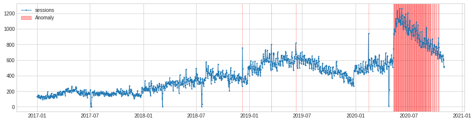
MinClusterDetector
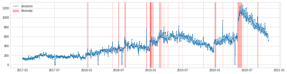
The MinClusterDetector model uses the KMeans() clustering algorithm from scikit-learn. It treats the time series as independent points and divides them into clusters, with the values in the smallest cluster considered anomalous.
min_cluster_detector = MinClusterDetector(KMeans(n_clusters=3))
anomalies = min_cluster_detector.fit_detect(df)
As the plot below shows, MinClusterDetector correctly identifies the period from the level shift anomaly following the ending of the lockdown as an anomalous cluster, but it only flags a few of the other anomalies in the data.
chart = plot(df,
     anomaly=anomalies,
     ts_linewidth=1,
     ts_markersize=3,
     anomaly_color='red',
     anomaly_alpha=0.3,
     curve_group='all')
Extracting the anomalies
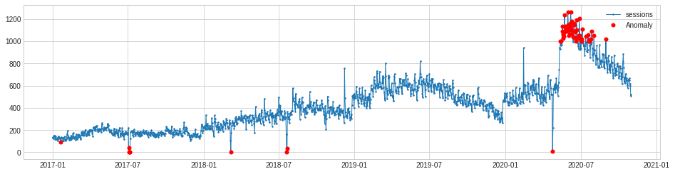
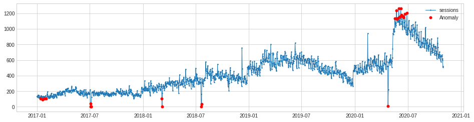
The PersistAD model set to c=2 and side='both' gave us the best results. It spotted pretty much all the anomalies in our data, including the spikes, outliers, and the level shift anomaly. To put this to use in an automated tool for detecting anomalies, we need to fetch the current data and capture the details on any anomalies detected.
persist_ad = PersistAD(c=2, side='both')
anomalies = persist_ad.fit_detect(s)
chart = plot(s,
     anomaly=anomalies,
     ts_linewidth=1,
     ts_markersize=3,
     anomaly_markersize=5,
     anomaly_color='red',
     anomaly_tag='marker')
We can extract the anomalies data from the model and convert it to a dataframe using results = anomalies.to_frame(). Then we can use pd.merge() to merge the original dataframe to the results. This gives us the data from the model, including a binary flag which identifies whether the model considered a particular value as anomalous.
The next step would be to run a workflow or cron job which runs the model (or several models examining different metrics) on a daily basis and triggers an email or Slack message if it encounters an anomaly for a recent date. I’ll cover how to do this in part two.
results = anomalies.to_frame()
results = pd.merge(df, results, left_index=True, right_index=True)
results = results.rename(columns={'sessions_x':'sessions','sessions_y':'anomaly'})
results.tail(100)
| sessions | anomaly | |
|---|---|---|
| date | ||
| 2020-07-24 | 854 | 0.0 |
| 2020-07-25 | 974 | 0.0 |
| 2020-07-26 | 1019 | 0.0 |
| 2020-07-27 | 1091 | 0.0 |
| 2020-07-28 | 987 | 0.0 |
| 2020-07-29 | 940 | 0.0 |
| 2020-07-30 | 882 | 0.0 |
| 2020-07-31 | 831 | 0.0 |
| 2020-08-01 | 895 | 0.0 |
| 2020-08-02 | 1055 | 1.0 |
| 2020-08-03 | 920 | 0.0 |
| 2020-08-04 | 926 | 0.0 |
Matt Clarke, Sunday, March 14, 2021


Other posts you might like

How to tune a LightGBMClassifier model with Optuna
The LightGBM model is a gradient boosting framework that uses tree-based learning algorithms, much like the popular XGBoost model. LightGBM supports both classification and regression tasks, and is known for...

How to create a customer retention model with XGBoost
Although all business know the importance of retaining customers, few companies are actually able to measure customer retention accurately, and fewer still can predict which ones will churn or be...